4.2.7. Monitoring
With all the information collected about the UNAC module, the Analytics component generates dashboards providing users with quick and comprehensive insights.
The dashboards utilize graphs and tables to organize the diverse and substantial volume of data collected from various sources. Users can apply filters and time periods to customize the displayed parameters. Please note that devices without recent updates won’t be included in the displayed events.
For access to these dashboards, navigate to Administration Portal > Analytics > UNAC.
4.2.7.1. UNAC Overview
The UNAC overview dashboard displays all the authentication features of user devices connected to the network. It includes information about the location of the devices and the policies associated with them. They are separated by connected, rejected, and network device queries.
4.2.7.1.1. Header
The three available views in the UNAC Overview section show different information about user devices and network devices. However, they have a common header, which refers to a consistent section at the top of each view that contains shared information.
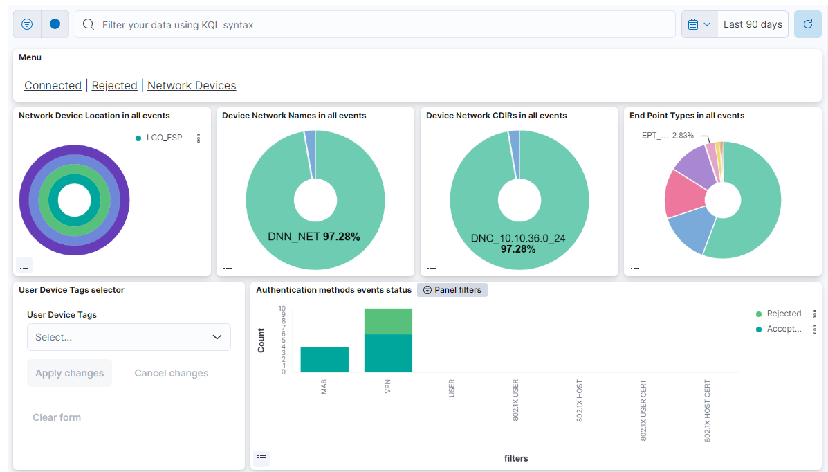
Menu
The menu features different windows, such as Connected, Rejected, and Network Devices. Each window offers distinct dashboard views, allowing you to navigate between these sections. The following topics will explore these menu options in detail.
This header first row composed of four dashboards allows filtering by Network Device Location, Device Network Name, Device Network CDIRs, Endpoint Types. It will always look for the temporary index that is regenerated every day. In this toolbar, filter your data using KQL syntax.
User Device Tags selector: Allows filtering by user device tags.
Authentication methods events status: Shows the 7 authentication methods with the count of the number of authentication events for this method in the Y axis. The count of events is divided between accepted or rejected authentications.
4.2.7.1.2. Connected
The Connected window displays a view of the latest user device events with successful authentication.
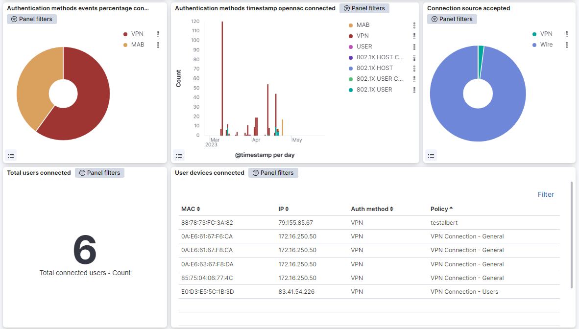
Authentication methods events percentage connected: Represents the percentage of successful authentication events for each method.
Authentication methods timestamp opennac connected: Shows the successful authentication events, separated by authentication method on a timeline.
Connection source accepted: Represents the percentage of successful authentication events with source VPN, Wi-Fi and Wire.
Total users connected: Shows the number of total user devices connected to the network.
User devices connected: Shows a table with the user devices connected to the network. In this table the MAC address, the IP, the authentication method and the policy of the user device are represented.
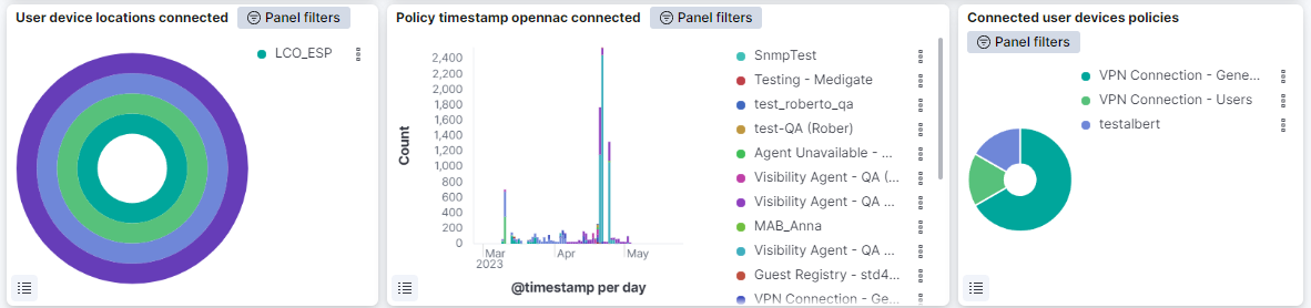
User device locations connected: This pie shows the locations of the successfully connected user devices of the network; the internal pie shows percentage of devices by country (LCO), the second pie the percentage of devices by city (LCI), the third pie the percentage of devices by building (LBD) and the external and last pie shows the percentage of devices by floor (LFL).
Policy timestamp opennac connected: Shows the successful authentication events, separated by the policy on a timeline.
Connected user devices policies: Represents the percentage of the policies of the connected user devices.
4.2.7.1.3. Rejected
The Rejected window displays the latest user device events with rejected authentication.
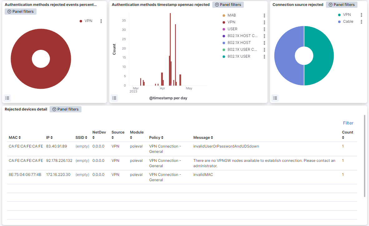
Authentication methods rejected events percentage: Represents the percentage of rejected authentication events for each method.
Authentication methods timestamp opennac rejected: Shows over time the rejected authentication events, separated by authentication method.
Connection source rejected: Represents the percentage of rejected authentication events with source VPN, Wi-Fi and Wire.
Rejected devices detail: Shows a table with the user devices rejected. Devices are represented in this table by MAC address, the IP, the SSID, the network device, the source, the module, the policy, the method and the number of times this event is repeated.
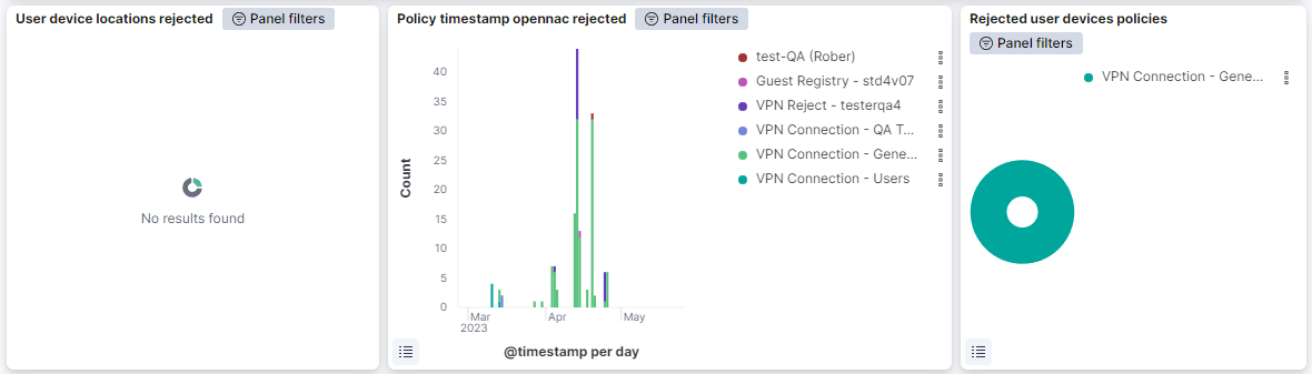
User device locations rejected: This pie shows the locations of the user devices that have been rejected from connecting to the network; the internal pie shows percentage of devices by country (LCO), the second pie the percentage of devices by city (LCI), the third pie the percentage of devices by building (LBD) and the external and last pie shows the percentage of devices by floor (LFL).
Policy timestamp opennac rejected: Shows the rejected authentication events, separated by the policy on a timeline.
Rejected user devices policies: Represents the percentage of the policies of the rejected user devices.
4.2.7.1.4. Network Devices
The Network Devices displays views about network devices connected to the network.
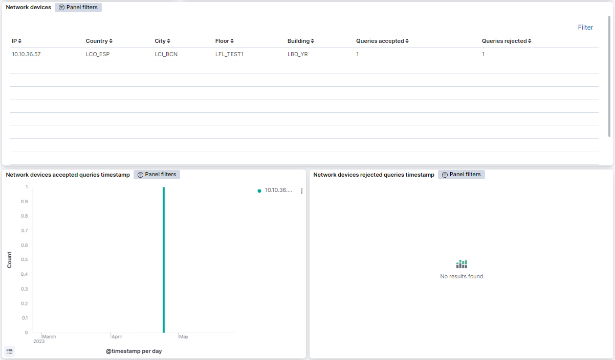
Network devices: Shows a table with the network devices. In this table network devices are represented by their IP, the Country, City, Floor and Building where they’re located, and the queries accepted and rejected for that network device.
Network devices accepted queries timestamp: Shows over time the accepted queries of the network devices, separated by network device IP.
Network devices rejected queries timestamp: Shows over time the rejected queries of the network devices, separated by network device IP.
4.2.7.2. UNAC Detail
Following the drill-down approach of the UNAC section, the UNAC Details dashboard displays detailed information about User Devices.
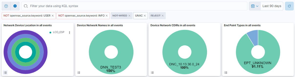
This header composed of four dashboards allows filtering by Network Device Location, Device Network Name, Device Network CDIRs, Endpoint Types. It will always look for the temporary index that is regenerated every day.
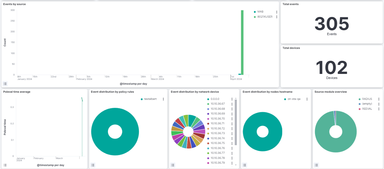
Events by source: The overtime events by source (SNP, 8021XUSER, IP, VPN)
Total events: The total number of opennac events.
Total devices: The total number devices that generate opennac events.
Poleval time average: A timestamp that shows the poleval time average.
Event distribution by policy rules: A pie chart that displays connections by policy rules.
Event distribution by network device: A pie chart that displays connections by network device.
Event distribution by nodes hostname: A pie chart that displays connections by nodes hostname.
Source Module overview: A pie chart showing the source module.
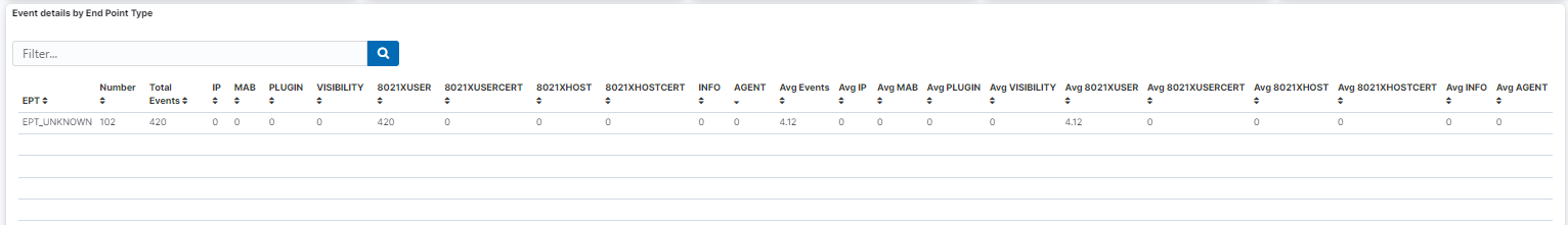
Event details by End Point Type: A table that shows the details of each event by EPT (number of events, source, etc).
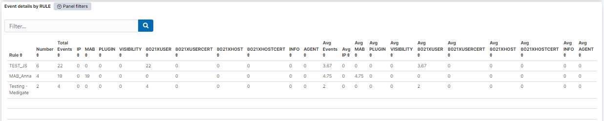
Event details by RULE: A table that shows the details of the events by policy.
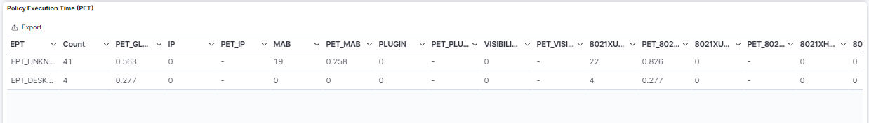
Policy Execution Time (PET): A table that shows the poleval execution time.
4.2.7.3. Authentication Metrics
The Authentication Metrics dashboard displays information about RADIUS requests. We can see the following views on this dashboard:
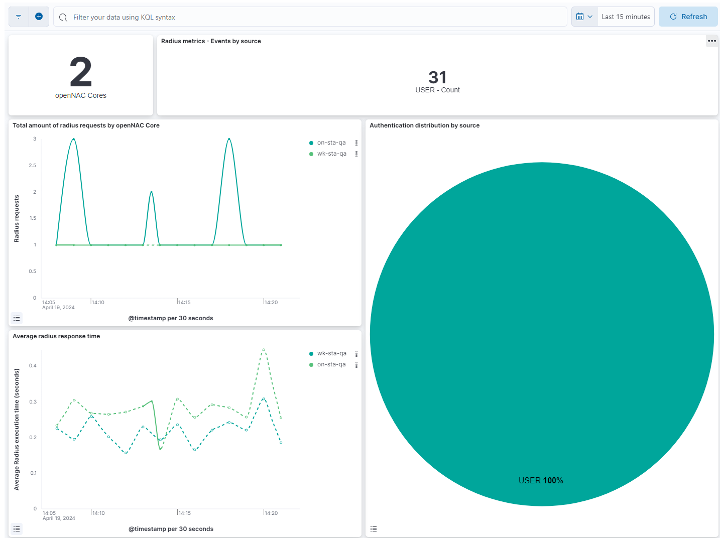
openNAC Cores: Shows the number of openNAC cores.
Radius metrics - Events by source: Shows the number of each openNAC source.
Total amount of radius requests by openNAC Core: Displays the total radius events for every host on a timeline.
Authentication distribution by type: Represents the percentage of the different radius sources.
Average radius response time - Seconds: Displays the average of execution time for radius events for every host on a timeline.
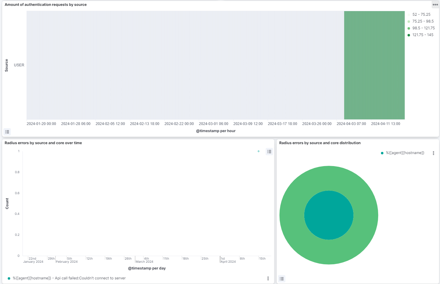
Amount of authentication requests by source: Shows a heatmap relating the radius source with hourly radius events count.
Radius errors by source and core over time: Displays the total radius events with error separated by the host and the error message type on a timeline.
Radius errors by source and core distribution: the internal pie represents the percentage of hosts. The external pie represents the percentage of the radius error message types.
4.2.7.4. Filtering in dashboards
In all the dashboards of the solution there is an upper bar to temporary filter the information that is shown in the graphs and tables of the dashboard.

4.2.7.4.1. Filter by variables
In this bar we can add new filters by clicking “+ Add filter” on the left
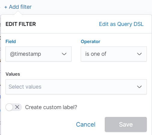
Here we can add the variable we want to filter by, for example, time, id, type and others. Once the variable is selected, we must indicate the operator, is, is not, etc. Depending on whether we want to search for a specific variable, ignore a specific variable in the graph and others. Finally, we indicate the value of the variable and save the filter by pressing “Save”.
If within a dashboard we click any variable that is in a graph, a filter will be generated with the same variable that will affect the overall dashboard.
4.2.7.4.2. Filtered by time period
To quickly filter, we can do it by selecting the icon shown in the figure below. This will open a dropdown where we can configure the time period of the dashboard.
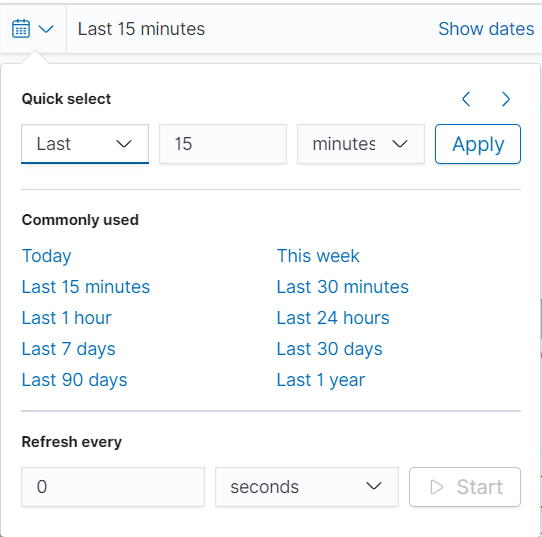
In the (Quick select) section, we can quickly select a time period from the current moment, for example, the last 15 minutes, hours, days, etc. In the (Commonly used) section we can select time periods that are frequently used and that are already preconfigured.
The last section configures the refresh rate of the graph (by default it is disabled). With this, we configure the graph update automatically when pressing “Start”. If we want to further customize the time period of the graph we can select each of the times (start and end) in which we can select the exact point.
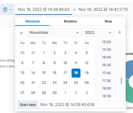
If we select the Absolute type, we will be asked for an exact calendar date. On the other hand, when selecting Relative, we must indicate a time from the current moment. If we select Now means that on every refresh the current time will be set to the time of the refresh.
It is important to take into account the rotability of the data. If the data rotability is defined to one month, we will only be able to obtain information up to one month before the current moment.