5.2.4. Trending NextGen
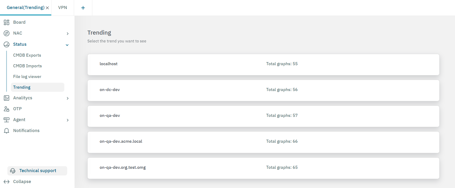
The Trending view allows you to to check the OpenNAC Enterprise performance and its trend. To locate the Trending section, go to the Administration Portal and in the Operate view open Status > Trending.
In this view, you can find information on the current status of the services and resources of the infrastructure components. This information is displayed in graph format.
Keep in mind that the most important aspect of thi section is its trends. We can locate anomalies in the graphs by looking for unexpected values.
Note
It is important to have the collectd service running. If you have multiple nodes deployed and you do not see its trending, please verify your collectd configuration on /etc/collect.d/network.conf
5.2.4.1. Configuring the collectd service
To configure the /etc/collect.d/network.conf, see the following examples:
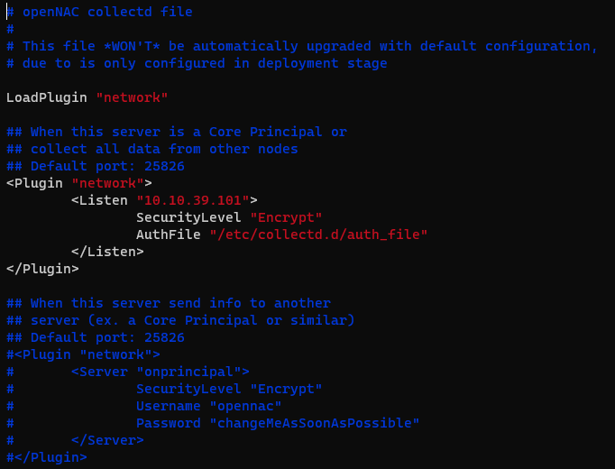
On the Principal node, the configuration on /etc/collect.d/network.conf should look like this:
# openNAC collectd file
#
# This file *WON'T* be automatically upgraded with default configuration,
# due to is only configured in deployment stage

LoadPlugin "network"

## When this server is a Core Principal or
## collect all data from other nodes
## Default port: 25826
<Plugin "network">
                <Listen "<onprincipal_IP>">
                                SecurityLevel "Encrypt"
                                AuthFile "/etc/collectd.d/auth_file"
                </Listen>
</Plugin>

## When this server send info to another
## server (ex. a Core Principal or similar)
## Default port: 25826
#<Plugin "network">
#       <Server "onprincipal">
#               SecurityLevel "Encrypt"
#               Username "opennac"
#               Password "changeMeAsSoonAsPossible"
#       </Server>
#</Plugin>
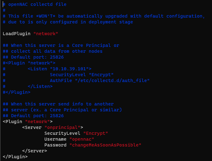
On the other nodes, the configuration on /etc/collect.d/network.conf should look like this:
# openNAC collectd file
#
# This file *WON'T* be automatically upgraded with default configuration,
# due to is only configured in deployment stage

LoadPlugin "network"

## When this server is a Core Principal or
## collect all data from other nodes
## Default port: 25826
#<Plugin "network">
#        <Listen "10.10.39.101">
#                SecurityLevel "Encrypt"
#                AuthFile "/etc/collectd.d/auth_file"
#        </Listen>
#</Plugin>

## When this server send info to another
## server (ex. a Core Principal or similar)
## Default port: 25826
<Plugin "network">
        <Server "onprincipal">
                        SecurityLevel "Encrypt"
                        Username "opennac"
                        Password "changeMeAsSoonAsPossible"
        </Server>
</Plugin>
All the information is stored in DDR Files. This increases graphs calculation and system response.
5.2.4.2. Visualizing trending graphs
After you select the trend you want to see from the initial view, you can open the different tabs to explore their graphs.
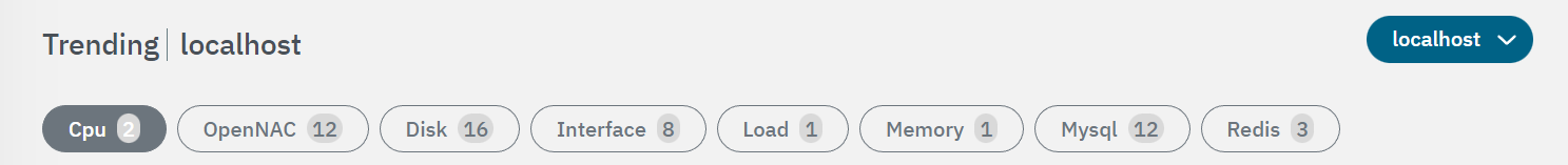
Cpu: Graphs regarding CPU usage.
OpenNAC: Graphs regarding OpenNAC Enterprise services.
Disk: Graphs regarding OpenNAC Enterprise disks.
Interface: Graphs regarding interfaces.
Load: Graphs regarding system components load.
Memory: Graphs regarding memory use.
Mysql: Graphs regarding database components.
Redis: Graphs regarding Redis component.
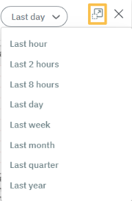
Each graph rendered has a drop-down menu that allows you to select time ranges from 1 hour to 1 year. You can also expand the graph by clicking on the icon highlighted on the following image.
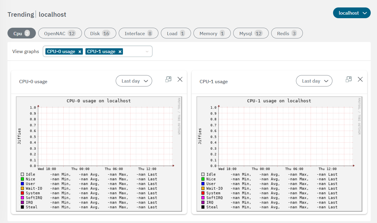
5.2.4.2.1. Trending CPU
From this view, we can see the usage of each CPU in our node in graph format. We are able to observe the measured use in Jiffies for the past few days and identify which service has used the CPU the most (User, Idle, System, etc.). This information defines the total minutes of usage, its average, maximum usage, and the last time the CPU was used.
We can find more information about the values that are shown in this CPU graph in the CentOS or RedHat documentations, since they are standard Linux values.
5.2.4.2.2. Trending OpenNAC
In this section, we can see OpenNAC Enterprise engine’s information. There is a total of 12 graphs.
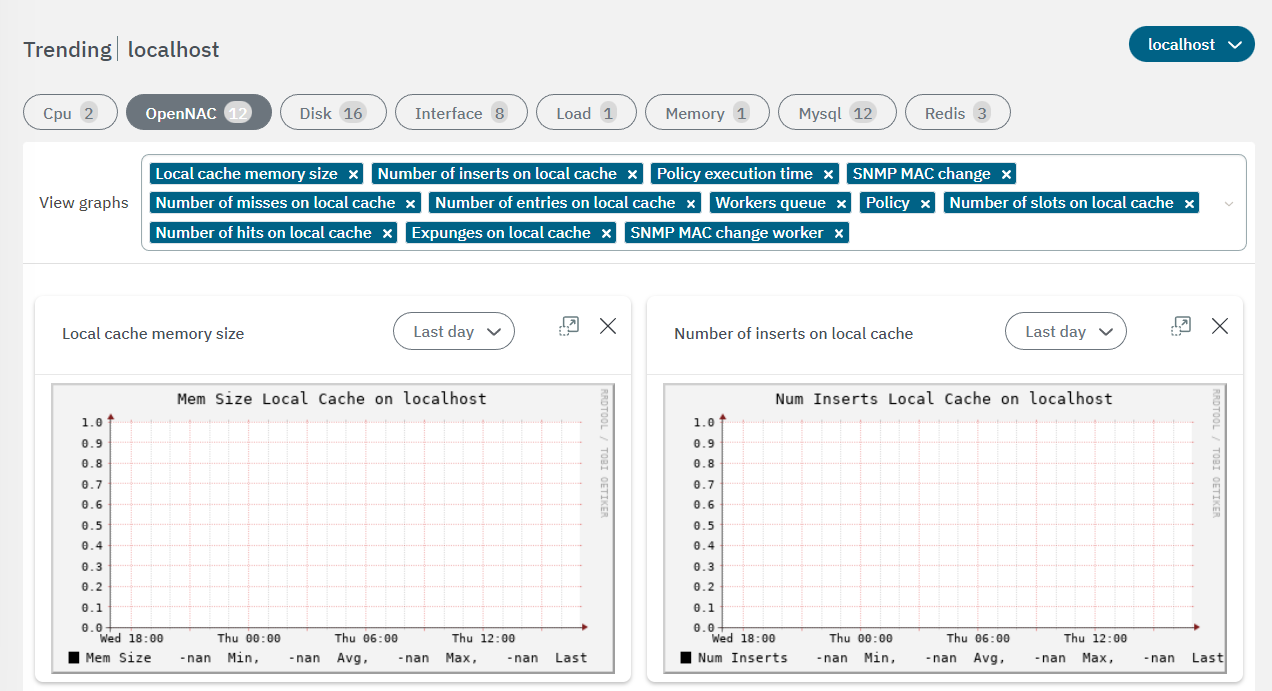
We can classify graphs into:
Cache memory used:
Expunges on local cache: If we see a notable increase in this graph, it means that an element has been purged. This can lead to some other graphs such as the Policy execution time to have considerable increases.
Local cache memory size
Number of entries on local cache
Number of hits on local cache
Number of inserts on local cache: With this graph, we can know, e.g. when cache memory restarts have been carried out, an event that can cause that some other processes at that time take longer than usual. But as mentioned before, the important thing is to be able to observe that, despite these sudden changes, the trend has been as expected.
Number of misses on local cache
Number of slots on local cache
Policy hits, policy execution time:
Policy: gives us information about the number of policies or executions of these that are taking place. We can see that in this graph we have two values, the Endyel Ini, which should normally look the same, since this indicates that all those that start also finish. If there is an imbalance, it would indicate that some policy has remained an unfinished process. With this graph, we can also know on what days or at what times we have more or less load of policy executions.
Policy execution time: tells us how long the policy takes to execute. In this graph, we can see a gray value, which is the actual execution time, and in black the average value of this.
Workers:
Worker queues: In this graph we can find the number of queues available, the pending queues and those that are being executed at the moment respectively. We will have to watch that the red and purple lines (pending and running queues) do not get too close to the total number of available queues. If we occupy all the queues we could find that our system cannot process more requests.
SNMP: on these graphs we can find information about the SNMP requests.
SNMP MAC Change
SNMP MAC Change Worker
PHP_FPM Pools: on these graphs we can find information about the PHP_FPM Pools Status.
PHP_FPM poleval processes: This graph indicates the number of the active, idle and total processes of Poleval PHP-FPM pool.
PHP_FPM www processes: This graph indicates the number of the active, idle and total processes of WWW PHP-FPM pool.
5.2.4.2.3. Trending Disk
From these graphs, you can see information on the latencies of the disks installed on the servers. It also displays information regarding the writing and reading processes of your disk, referenced in green and blue respectively.
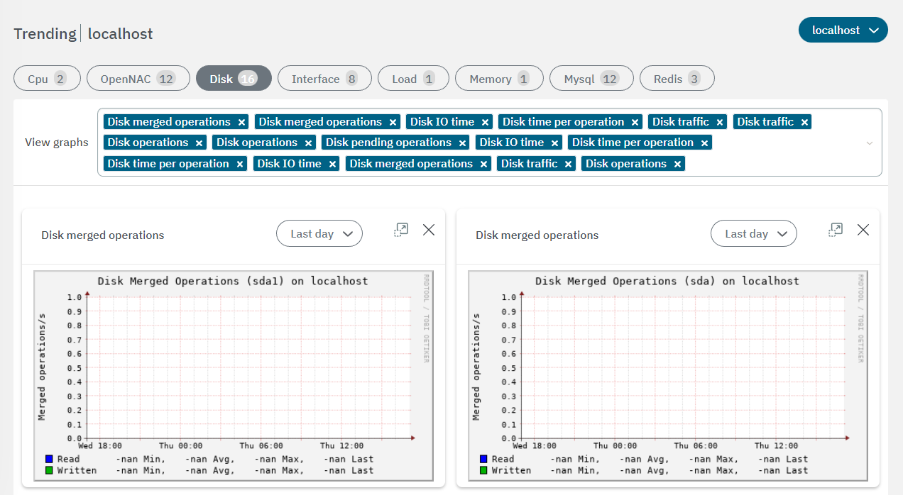
We will see 5 charts for each disk:
Disk IO time: Time spending I/Os.
Disk merged operations: The total of the merged operations that have been carried out on the disk.
Disk traffic: The data traffic that has been written to and read from the disk.
Disk operations: The total operations per second that have been carried out on the disk every second.
Disk time per operation: The average time it took for the disk to perform each operation.
5.2.4.2.4. Trending Interface
The Interface tab displays information for all the interfaces installed on OpenNAC Enterprise Servers. You can see the information referring to the data transmission and reception processes, referenced in green and blue respectively.
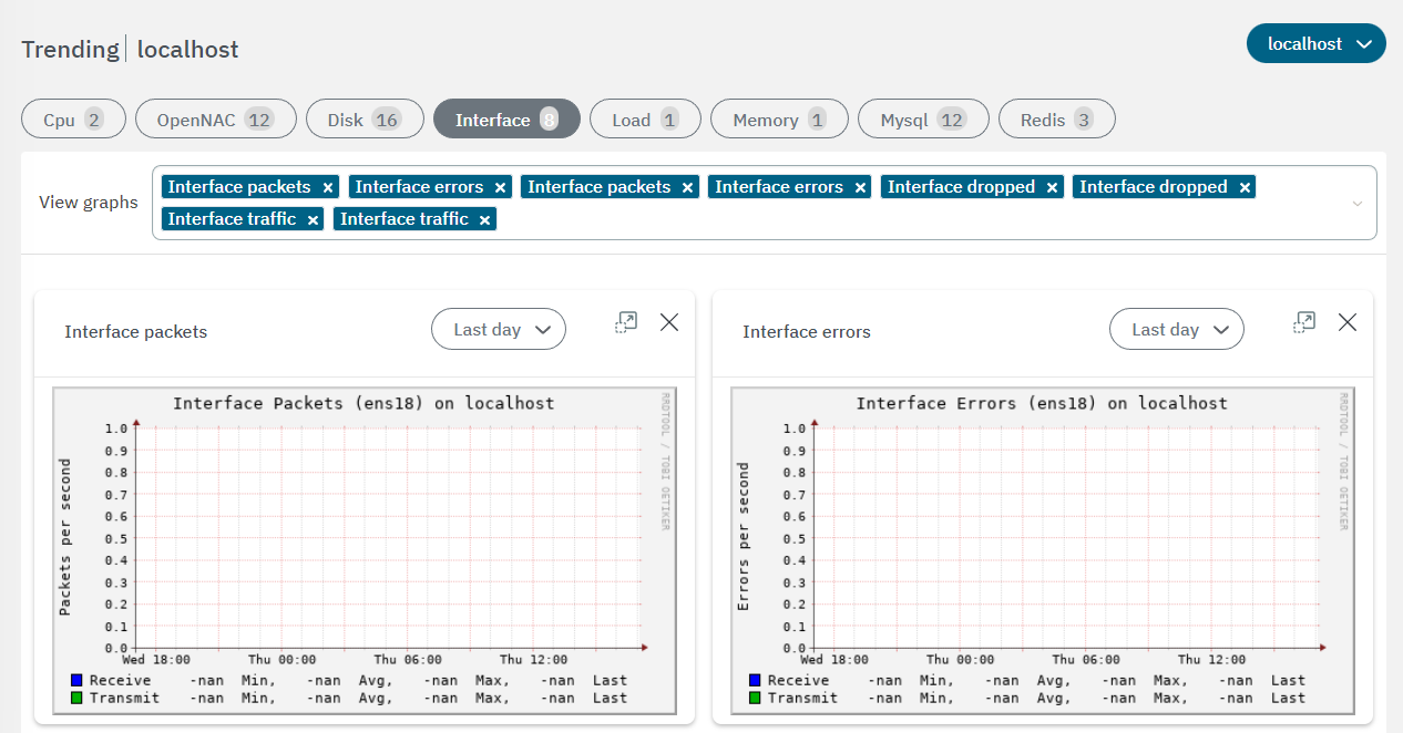
We will see 3 charts for each interface:
Interface Errors: We can see the errors per second that our system has encountered when transmitting or receiving data through said network interface.
Interface packets: The number of packets transmitted and received per second by that network interface.
Interface Traffic: The traffic, indicated in bytes per second, that has been transmitted or received by said network interface.
5.2.4.2.5. Trending Load
Use this this view to check the system load.
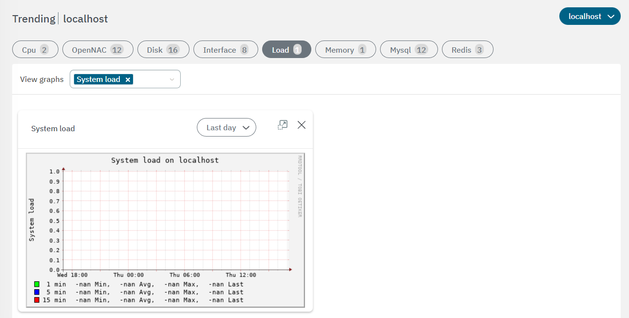
System Load: In this graph, we can determine whether the system load is greater than or less than 1.0, indicating an overloaded or insufficiently charged system, respectively. This data is available for the last minute, last 5 minutes, or last 15 minutes, and can also be obtained by running the top command through the system’s command-line interface (CLI).
5.2.4.2.6. Trending Memory
In this section, you can review information related to memory load trend.
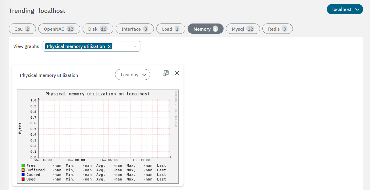
Physical memory utilization: This graph shows the total amount of memory, including the amount being used, the amount used for Cache memory, the amount used for Buffered memory, and the amount that is currently free. The most important detail to observe is that the memory being used, highlighted in red, does not occupy the entire graph. If it did, it would indicate that the device memory is completely filled.
5.2.4.2.7. Trending MySQL
Within this graphs, you can review MySQL trends. There is a total of 12 charts:
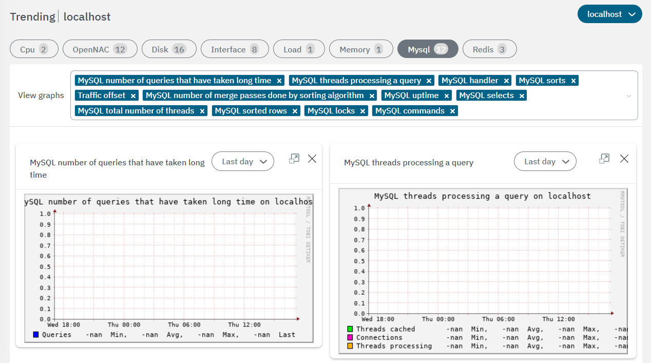
We can classify graphs into:
MySQL commands: The type of commands executed by the different tasks (“issues”) per second (i.e., show master status, flush, grant)
MYSQL handler: The different invocations of the handler (i.e., commit, delete)
MySQL locks
Traffic offset: With this graph we can see the information regarding the bytes per second transmitted and received by our database, referenced in green and blue respectively.
MySQL selects
MySQL number of queries that have taken long time
MySQL sorts
MySQL number of merge passes done by sorting algorithm
MySQL sorted rows
MySQL threads processing a query
MySQL total number of threads
MySQL uptime
5.2.4.2.8. Trending Redis
This section allows reviewing Redis trends.
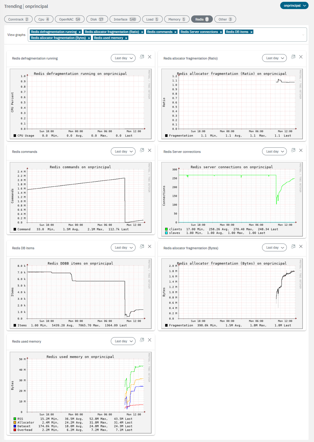
We can see information related to the redis service:
Redis defragmentation running: CPU usage percentage during Redis defragmentation processes.
Redis allocator fragmentation (Ratio): Ratio of memory fragmentation
Redis commands: The number of redis commands executed.
Redis Server connections: The number of connections to the Redis server from clients and slaves.
Redis DB items: The number of items stored in the Redis database.
Redis allocator fragmentation (Bytes): The amount of fragmented memory in bytes
Redis used memory: Total amount of memory currently used by the Redis server.