4.1.6. Operation
In this section, we will detail all those dashboards that, from a basic operation point of view, will provide us with useful information about the Visibility of our network.
Note
To carry out the operation of the Visibility module, it is essential to have correctly deployed the necessary components and their correct configuration.
The main objectives of this section are:
Analyze the information contained in the Business Profiles.
Understand the information available in the solution’s dashboards.
Learn to filter the information within the dashboards
4.1.6.1. Initial Dashboard
When accessing the OpenNAC Web Administration Portal (installed on the ON Core component by default), the first thing that will appear will be the initial dashboard. This dashboard shows information about the devices of the last 30 days.
Note
The devices with MAC 00:00:00:00:00:00 are excluded from this tab.
In this first dashboard, we can find basic but useful information, as detailed below.
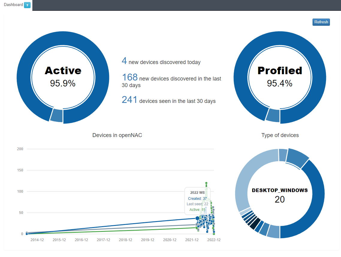
In the Active/Inactive pie chart, we can see the percentage of devices that are currently active on the network.
The central part of the dashboard shows 3 relevant numbers:
Total number of devices discovered in the last 24 hours.
Total number of devices discovered in the last 30 days.
Total number of devices seen in the last 30 days, we understand as a seen device any known device (previously discovered) that has connected to the network.
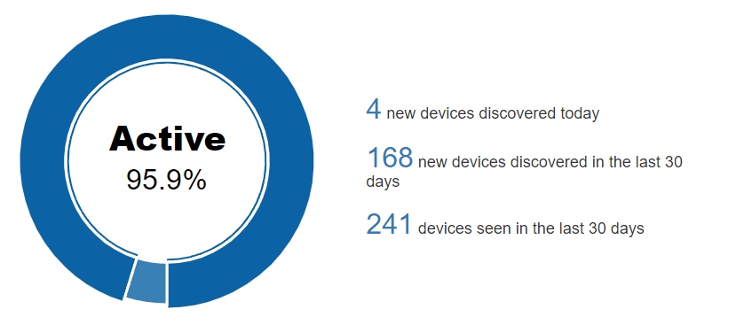
In the Profiled/Not profiled pie chart, we can see the percentage of total devices that have been profiled and those that have not. In other words, once discovered, the percentage of devices that could have their type determined and the percentage that could not.
Profiled information largely corresponds to the Visibility module.
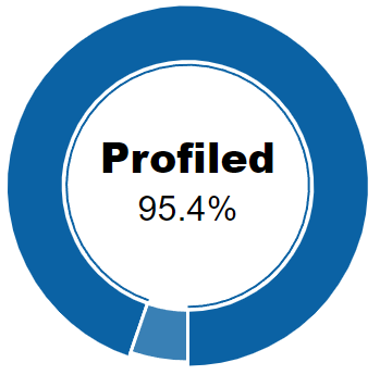
The last pie chart on the bottom right, shows the number of devices identified classifying them by their type. For example, in this case we have discovered and profiled 82 “MOBILE” devices on our network.
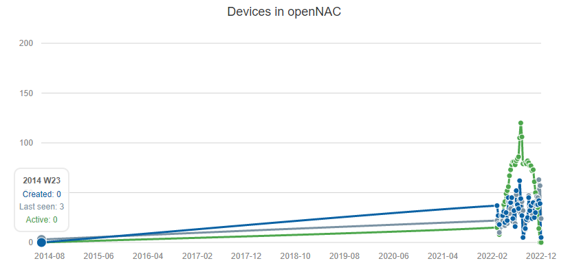
Finally, we have the line chart with 3 variables:
Created: Devices created/discovered during the week.
Last seen: Devices seen during the week.
Active: Active devices during the week.
4.1.6.2. Business Profiles
In Web Administration Portal, we can find the Business Profiles section (inside the ON NAC menu) where we will be able to see the latest status of the connections made on the network that have been detected by the system. For each of these connections we will have information related to the device and the connection itself: status, source, policy, etc.
4.1.6.2.1. Default View
In the Default View window, we see several Business Profiles, where each of them can group the connection statuses depending on the policy in which they have entered.
These groups are created to structure and organize these connections in environments where there may be many devices and connections, thus facilitating the queries in this section.
There is no limitation regarding the number of Business Profiles. It is possible to have as many as necessary for the module.
To access the Default View we must go to ON NAC -> Business Profiles -> Default View
Here we can see in the form of a list the latest states of all those connections to the network. The information of each connection is grouped in following columns:
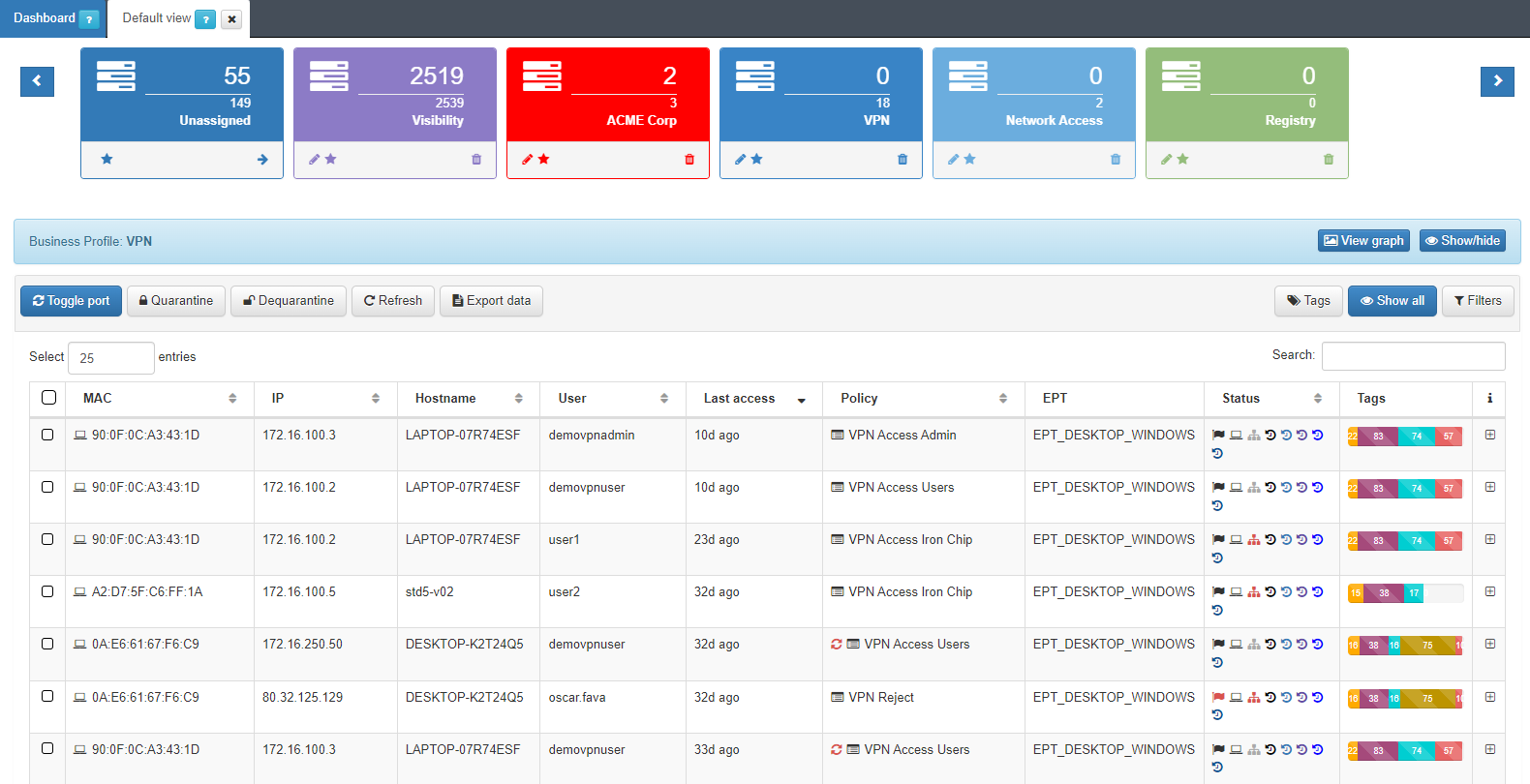
MAC: MAC address of the device.
IP: IP assigned to the device.
IP Switch: IP of the switch to which the device has been connected.
Hostname: Hostname of the device in case it is discovered.
User: User with which the device authenticates.
Last Access: Time elapsed since the last event related to the user.
Policy: Policy with which the device has matched.
Vlan: Vlan that has been assigned to the device. The VLANs must be previously defined in the system since it does not perform an active discovery of VLANs.
Source: Connection source type (802.1x, Visibility, VPN, etc.)
EPT: Tag* referring to the type of device (End Point Type).
Status: Status of the connection (Active/Disconnected, vlan assigned, etc.).
Tags: Numerical representation of the Tags* assigned to the device.
It is possible to access the Sensor and Discover dashboards directly with a filter of the device’s MAC by pressing the icons (  ) in the status column for each of the devices.
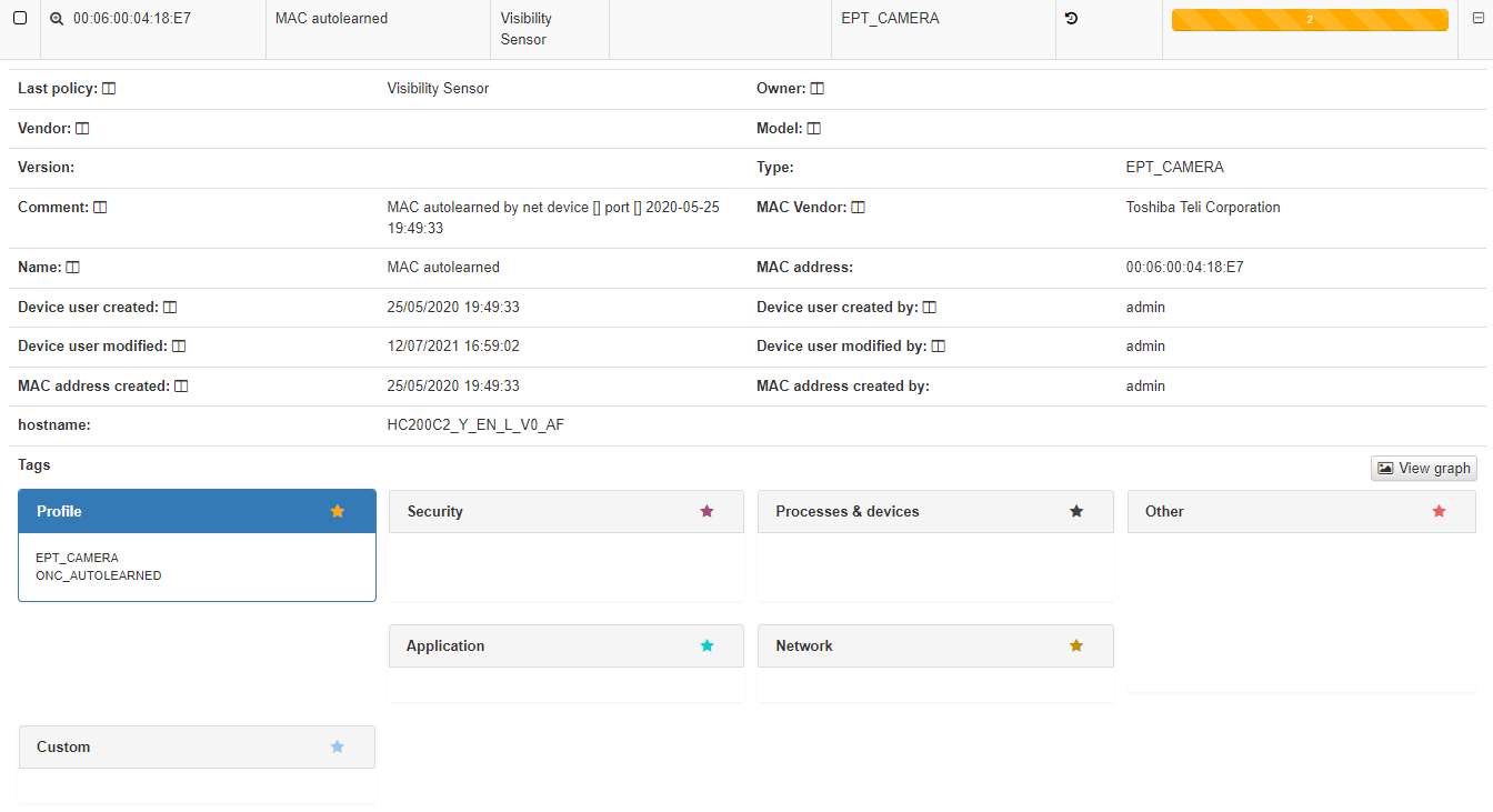
We can obtain detailed information on each of the connections. For this, we must click on the + button on the right end of the row that we want to expand.
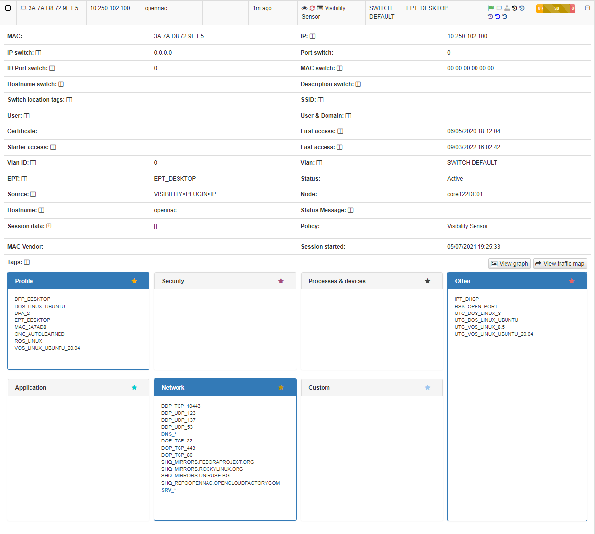
In this drop-down section, we can find all the information related to the device and the connections that has been made, obtained using the different Visibility methods (802.1x, plugins, agent, etc.)
At the top, we find all the basic information of the connection like Mac, Hostname, User, policy, source of the connection, etc.
At the bottom, we find the TAGs*, which are labels that are assigned to the devices to provide us with information about them. These tags are classified by families represented by three letters at the beginning of the tag followed by an “_” and the specific characteristic. For example, the tag “ROS_WINDOWS” indicates a Root Operating System of type Windows. You can check all the available tags in the Reference Guide -> Tags Table
Based on the previous classification of the TAGs, these are segmented into blocks and give us relevant information in relation to the device. These blocks are:
Profile: Profiling tags, device type, operating system, system information, etc.
Security: Tags related to device security such as antivirus or firewall information.
Processes: Processes that are running on the device.
Application: Information about the applications installed on the device, as well as their versions.
Network: Network information such as open ports.
Custom: Custom tags.
Other: Other tags with important information, for example, IP obtaining mode (IPT_DHCP).
Most of the fields contained in a Business Profile entry contain a window icon. By pressing this icon, it will be added as a column to all Business Profile entries.
4.1.6.2.2. EPT View
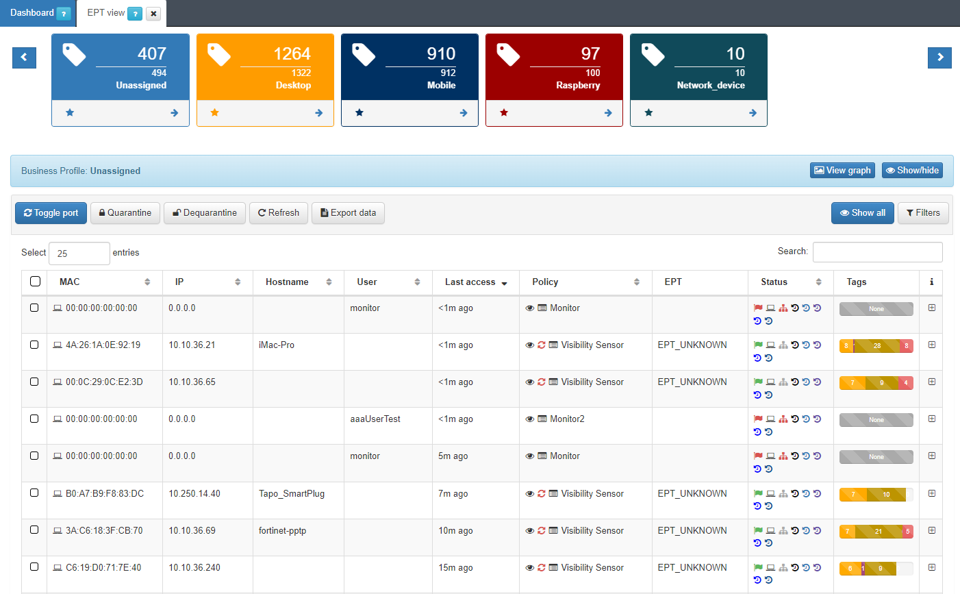
In the Business Profiles section, we can also see another profile that shows us a group of devices classified by the EPT label, End Point Type. By default, we have the “EPT View” profile.
The system has the ability to assign a profile to a device that has been discovered on the network, this is possible thanks to a set of predefined profiling rules. New profiling rules can be added or existing ones modified according to the requirements that each client decides to define.
After executing these profiling rules, the EPT_<Device Type> tag is inserted into the discovered device.
To access the Business Profiles of EPT View we must go to ON NAC -> Business Profiles -> EPT View
4.1.6.3. CMDB - User Devices
The CMDB is the ON Core database, in this database we find information related to the system, infrastructure, networks, VLANs, Security Profiles, user devices, network devices, etc. In the Visibility module, we are mainly interested in the information found in the User devices section.
To access this section, go to ON CMDB -> User Devices. Here we will find a list of all those devices that have ever been connected to the network and have been discovered by the system.
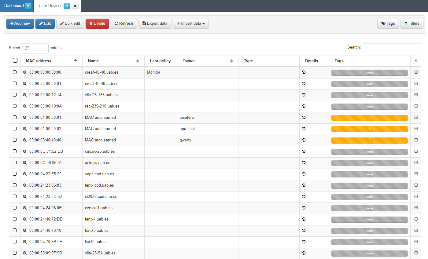
Each of the columns tells us certain information about the device. We can expand this information by pressing the + on the right side of each of the devices.
In the dropdown with the device information, we can see the basic information like MAC, Type, creation date, Hostname, etc. This information is similar to what we can have in the Business Profiles but, in this case, information about the status of the connection is not displayed, only information related to the characteristics of the device. At the bottom we find the blocks, sorted by categories, where all those TAGs* assigned to this device are specified.
4.1.6.5. Visibility Dashboards
With all the information related to network visibility that the system collects, dashboards are generated so that this information can be read and interpreted quickly and easily by the user. As a large volume of data of different types and sources is generated, different dashboards have been defined that group this information through graphs and tables.
All Dashboards have filters that allow us to define which parameters to show and/or which time period of the data will be used to generate said dashboards. Keep in mind that, if in the indicated period of time there has been no update on a specific device, through some event, this device will not appear.
4.1.6.5.1. OpenNAC Dashboard
The openNAC Dashboard shows us different graphs created from the information collected by ON Core and ON Sensor, information related to the different sessions and events, information about tags, user devices and policies.
To access this dashboard we have to go to Analytics -> openNAC -> OpenNAC Dashboard.
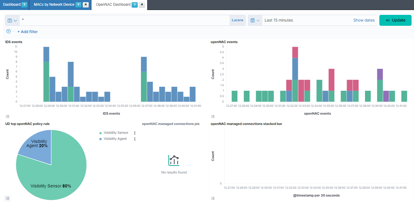
IDS events: Shows over a timeline the total of events of bro separated by the event type. The different types that we can find are: bro-conn_log, bro-dns_log, bro-http_log, bro-files_log, bro-dhcp_log, bro-notice_log, bro-ssl_log, bro-x509_log, bro-kerberos_log, bro-radius_log, bro-ssh_log, bro-snmp_log, bro-sip_log, bro-dpd_log, bro-smtp_log, bro-arp_log, bro-modbus_log, bro-rfb_log, bro-rdp_log, bro-ntlm_log, bro-socks_log, bro-tunnel_log, bro-rpc_log, bro-pe_log, bro-smb_files_log, bro-smb_mapping_log, bro-s7comm_log, bro-profinet_log, bro-bacnet_log, bro-enip_log, bro-dnp3_log and bro-syslog_log.
openNAC events: Shows over a timeline the total of events of opennac separated by the opennac source. Some of the opennac sources we can find are: plugin, ip, user, reeval, agent, mab, 8021xuser, info, and macdiscover.
UD top openNAC policy rule: Represents the percentage of the different policy rules events.
openNAC managed connections pie: Represents the percentage of the bro connections managed, coming from the sensor, and not managed.
openNAC managed connections stacked bar: Shows over a timeline the total of events of bro connections separated by if the connection is managed, from the sensor, or not managed.
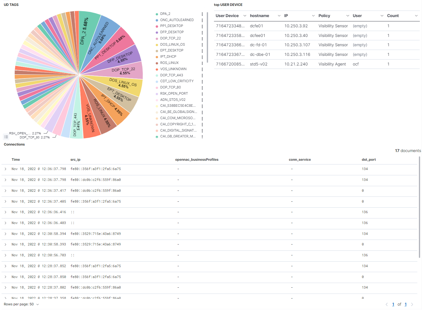
UD TAGS: Represents the percentage of the different UD TAGS.
top USER DEVICE: Shows a table with the top 10 user devices. In this table the User device id is represented, as well as the hostname, the IP, the policy rule, the user and the count this event has been repeated.
Connections: Shows a table with the most recent connections. In this table, the timestamp is represented, as well as the source IP, the opennac business profile, the connection service and the destination port.
4.1.6.5.2. User Devices
In the User Devices dashboard, we will be able to see different graphs created from the information collected regarding user devices. These TAGS can be generated with or without the agent, although with the agent we will be able to generate more graphs and obtain more complete information.
We can find this dashboard in Analytics -> openNAC -> User Devices
Remember that the information shown in the dashboards is filtered by a time range, if in this period of time any device has not had any updates, it will not appear in the dashboard.
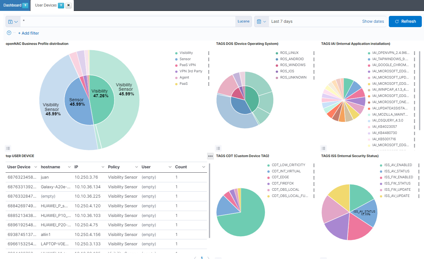
openNAC Business Profile distribution: The internal pie represents the percentage of opennac business profiles. The external pie represents the percentage of opennac policy rules.
TAGS DOS (Device Operating System): The internal pie represents the percentage of ROS (ROOT OPERATING SYSTEM) tags. The external pie represents the percentage of DOS (DEVICE OPERATING SYSTEM) tags.
TAGS IAI (Internal Application installation): Represents the percentage of IAI (INTERNAL APPLICATION INSTALLATION) tags.
top USER DEVICE: Shows a table with the top 10 user devices. In this table, the User device ID is represented, as well as the hostname, the IP, the policy rule, the user and the amount of times this event is repeated.
TAGS CDT (Custom Device TAG): Represents the percentage of CDT (CUSTOM DEVICE TAG) tags.
TAGS ISS (Internal Security Status): Represents the percentage of ISS (INTERNAL SECURITY STATUS) tags.
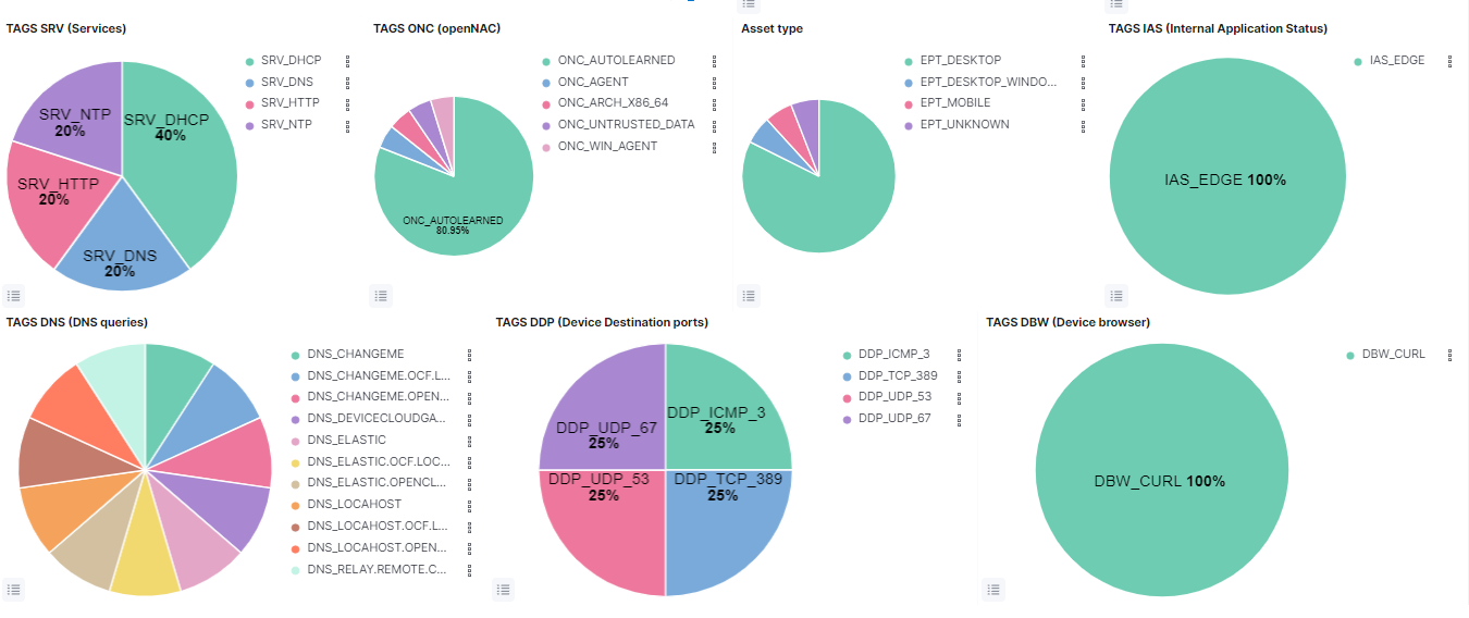
TAGS SRV (Services): Represents the percentage of SRV (SERVICES) tags.
TAGS ONC (openNAC): Represents the percentage of ONC (OPENNAC TAGS) tags.
Asset type: Represents the percentage of EPT (END POINT TYPE) tags.
TAGS IAS (Internal Application Status): Represents the percentage of IAS (INTERNAL SECURITY STATUS) tags.
TAGS DNS (DNS queries): Represents the percentage of DNS (DNS QUERIES) tags.
TAGS DDP (Device Destination ports): Represents the percentage of DDP (DEVICE DESTINATION PORTS) tags.
TAGS DBW (Device browser): Represents the percentage of DBW (DEVICE BROWSER) tags.
4.1.6.5.3. User Devices Overview
In this dashboard, we will generally observe several aspects related to the user devices that exist in the network.
We can find this dashboard in Analytics -> openNAC -> User Devices Overview
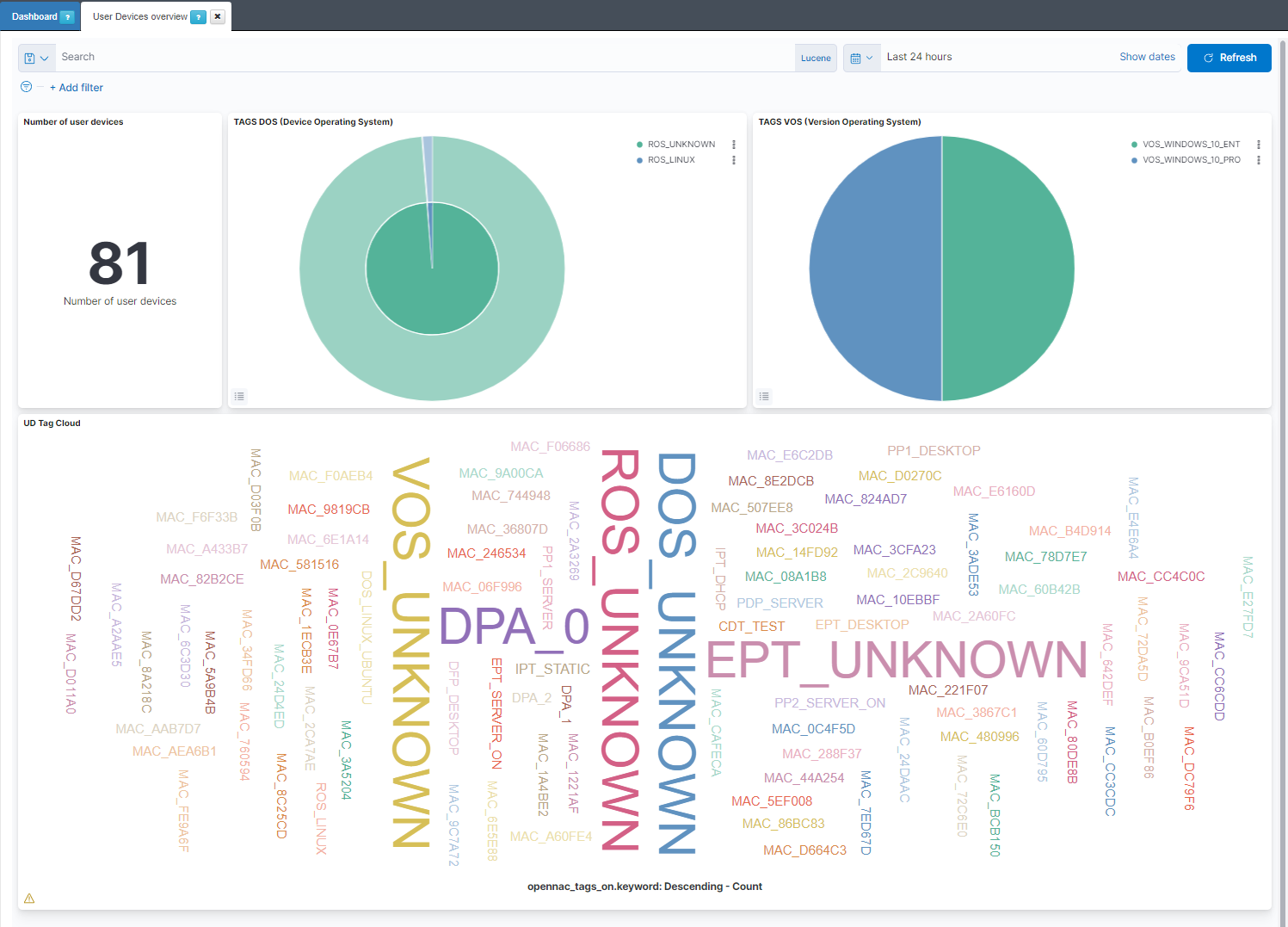
Number of user devices: Shows the number of user devices.
TAGS DOS (Device Operating System): The internal pie represents the percentage of ROS (ROOT OPERATING SYSTEM) tags. the external pie represents the percentage of DOS (DEVICE OPERATING SYSTEM) tags.
TAGS VOS (Version Operating System): Represents the percentage of VOS (VERSION OPERATING SYSTEM) tags.
UD Tag Cloud: Shows the most found tags and allows filtering them by clicks.
4.1.6.5.4. Sensor Dashboard
This dashboard shows the data that has been collected by ON Sensor, the behavior of the network for all those devices discovered, network traffic, bandwidth, VLANs, HTTP methods, and the rest of the information collected by ON Sensor.
ON Sensor decodes protocols and tracks all activities on the network where it is installed. For this reason, ON Sensor is implemented where the greatest amount of client traffic is generated and transmitted, this can be implemented in on-premise installations or remotely (using RSPAN or ERSPAN) as long as the network allows it.
To access the dashboard we must go to Analytics -> Sensor -> Sensor Dashboard.
4.1.6.5.4.1. Header
There are different windows displaying information captured by the sensor, but all of them have the same common header.
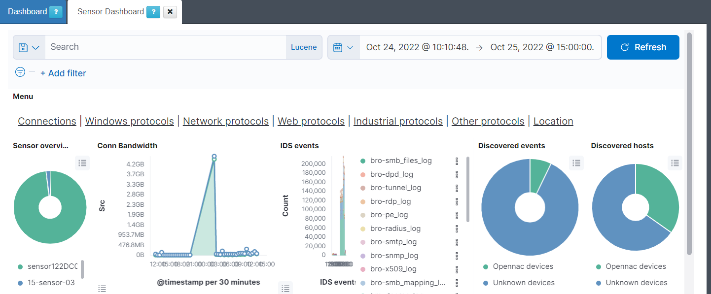
Menu: Shows the different windows of the dashboard and permits moving between them. The windows are Connections, Windows protocols, Network protocols, Web protocols, Industrial protocols, Other protocols and Location.
Sensor overview: Represents the percentage of the different ON Sensor that are generating the events.
Conn Bandwidth: Shows the total bandwidth of requests and responses to see the traffic that the bro index is generating on a timeline.
IDS events: Shows the total of events of bro separated by the event type on a timeline. The different event types are: bro-conn_log, bro-dns_log, bro-http_log, bro-files_log, bro-dhcp_log, bro-notice_log, bro-ssl_log, bro-x509_log, bro-kerberos_log, bro-radius_log, bro-ssh_log, bro-snmp_log, bro-sip_log, bro-dpd_log, bro-smtp_log, bro-arp_log, bro-modbus_log, bro-rfb_log, bro-rdp_log, bro-ntlm_log, bro-socks_log, bro-tunnel_log, bro-rpc_log, bro-pe_log, bro-smb_files_log, bro-smb_mapping_log, bro-s7comm_log, bro-profinet_log, bro-bacnet_log, bro-enip_log, bro-dnp3_log and bro-syslog_log.
Discovered events: Represents the total of events discovered by OpenNAC Enterprise versus the events that can’t be discovered and represent unknown devices. One device can generate many events.
Discovered hosts: Represents the total of devices discovered by OpenNAC Enterprise versus the devices that can’t be discovered and represent unknown devices.
4.1.6.5.4.2. Connections
This window displays the connections logs captured by the ON Sensors.
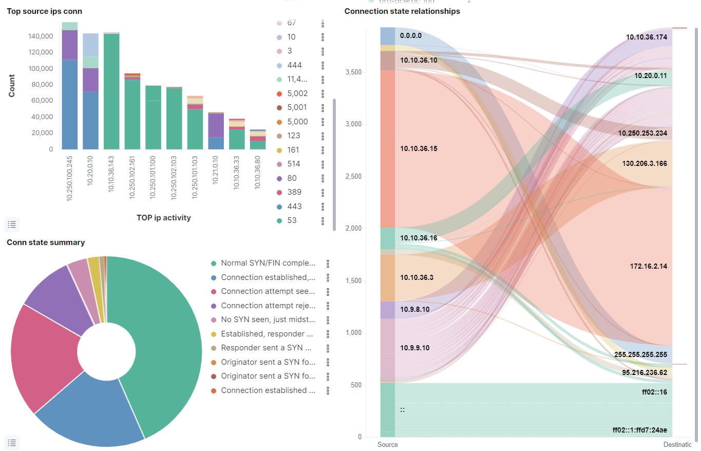
Top source ips conn: Shows the top 10 IPs with more connections indicating in the Y axis the total of connections. The connections are divided by the destination port of the connection
Conn state summary: Represents the percentage of the top 10 most found connection states.
Connection state relationship: Shows the connection relationship between the different IPs separating in the left the source IPs and in the right the destination IPs.
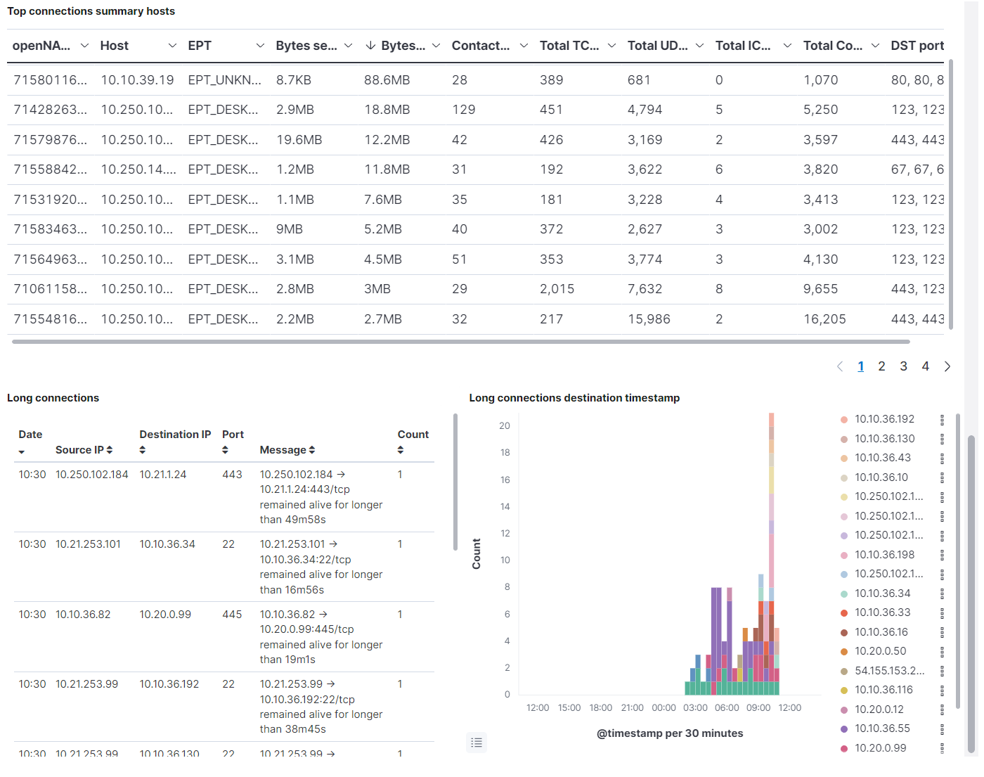
Top connections summary hosts: Shows a table of the top 100 connections showing the OpenNAC Enterprise ID, the host IP, the EPT type, the bytes send and received, the contacted host, the total TCP connections, the total UDP connections, the total ICMP connections, the total connections (the summarization of TCP, UDP and ICMP connections), and the last five destination port.
Long connections: Shows a table with the connections tagged as long. These connections are those that are running during a large period of time, like hours or days. In this table the Date when an event of long connection is detected is shown, and also the source and the destination IP of the connection, the port and the message, that shows the time the connection has been alive.
Long connections destination timestamp: Show over time when the long connections are noticed, separated by destination IP.
4.1.6.5.4.3. Windows protocols
This window displays windows protocol logs captured by the ON Sensors. These protocols are NTLM (windows New Technology Local area network Manager), SMB (Server Message Block), DCE RPC (Data Circuit-terminating Equipment Remote Procedure Call), RDP (Remote Desktop Protocol), RFB (Remote Frame Buffer) and PE (Portable Executable).
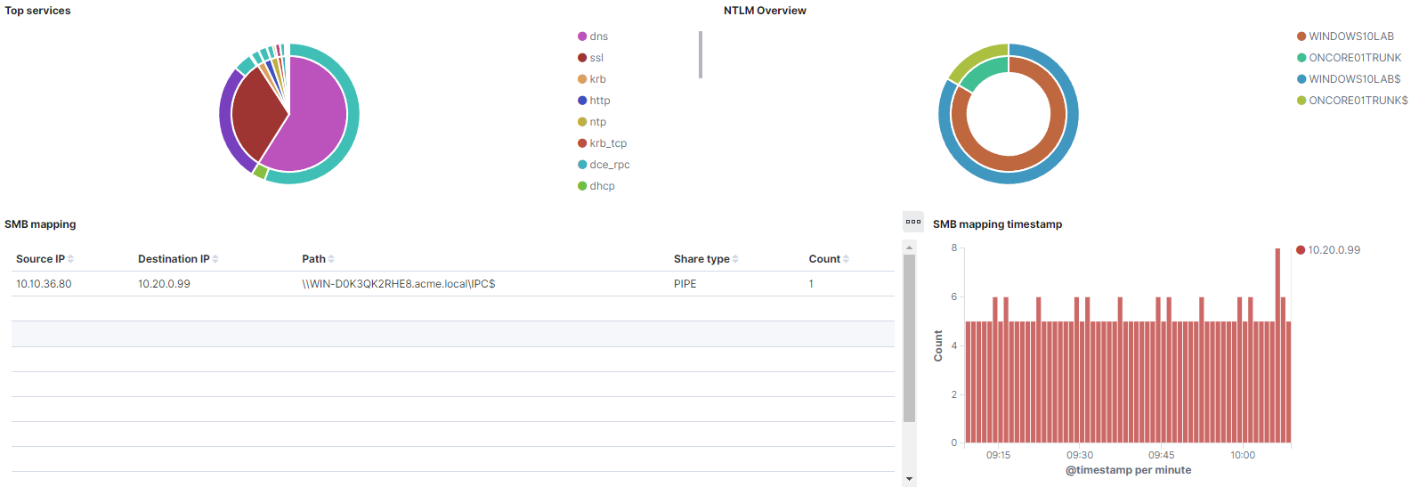
Top services: The internal pie represents the percentage of the events that exist from each service. Some of these services are dns, ssl, nto, krb, http, dce_rpc, dhcp, ssh. The external pie represents the percentage of messages of every event.
NTLM Overview: The internal pie represents the percentage of the top 10 NTLM hostnames, and the external pie, the username of the NTLM host.
SMB mapping: Shows a table with the SMB mapping events. This table has the source IP and the destination IP, the path, the share type, and the count each event has been repeated.
SMB mapping timestamp: Shows all the SMB mapping events, separated by destination IP on a timeline.
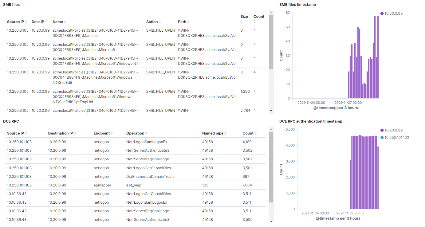
SMB files: Shows a table with the SMB files events. This table represents the source IP and the destination IP of each connection, the name of the file, the action of SMB over the file, the path, the size, and the amount of times this event is repeated.
SMB files timestamp: Shows all the SMB file events, separated by destination IP on a timeline.
DCE RPC: Shows a table with DCE RPC events. In this table the source IP and the destination IP of each connection is represented, as well as the endpoint, the operation, the named pipe, and the amount of times this event is repeated.
DCE RPC authentication timestamp: Shows all the DCE RPC events, separated by destination IP on a timeline.
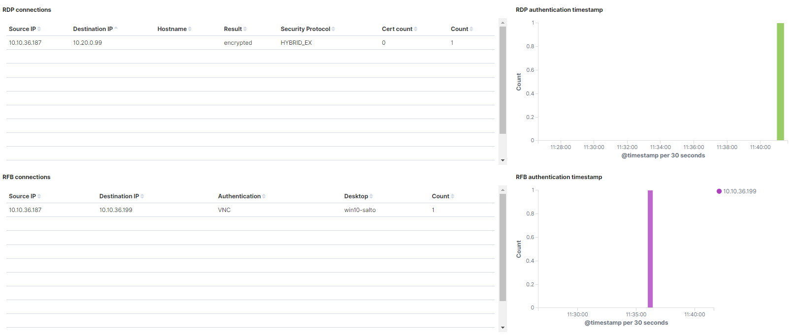
RDP connections: Shows a table with RDP events. In this table the source IP and the destination IP of each connection is represented, as well as the hostname, the result, the security protocol, the certificate count, and the amount of times this event is repeated.
RDP authentication timestamp: Shows all the RDP events, separated by destination IP on a timeline.
RFB connections: Shows a table with RDP events. This table represents the source IP and the destination IP of each connection, as well as the authentication method, the desktop, and the amount of times this event is repeated.
RFB authentication timestamp: Shows all the RFB events, separated by destination IP on a timeline.
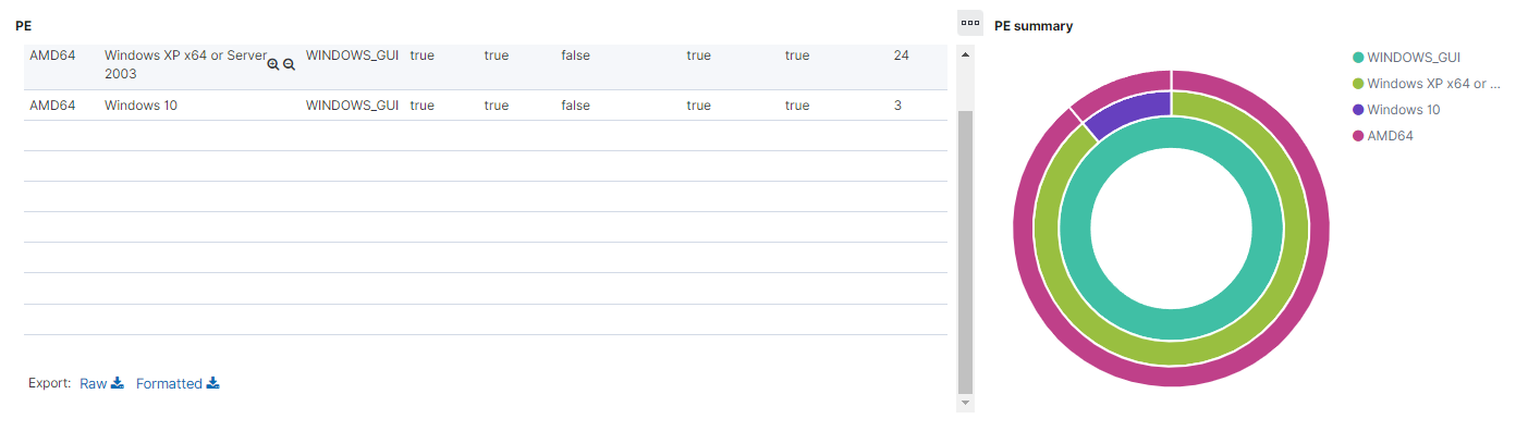
PE: Shows a table with RDP events. In this table there are values for each source machine that generates this event, their operating system, if the portable executable is executable, if its size is 64b, its code integrity, if it has cert table, if it has debug data, and the amount of times this event is repeated.
PE summary: The internal pie represents the percentage of the PE machines subsystem. The middle pie represents the percentage of operating systems for every subsystem. And the external pie represents the percentage of the PE machines for every operating system.
4.1.6.5.4.4. Network protocols
The Network protocols displays views of the network protocol logs captured by the ON Sensors. These protocols are VLAN (Virtual Local Area Network), DHCP (Dynamic Host Configuration Protocol), RADIUS (Remote Authentication Dial-In User Service), Kerberos, SNMP (Simple Network Management Protocol) and VXLAN (Virtual Extensible Local Area Network).
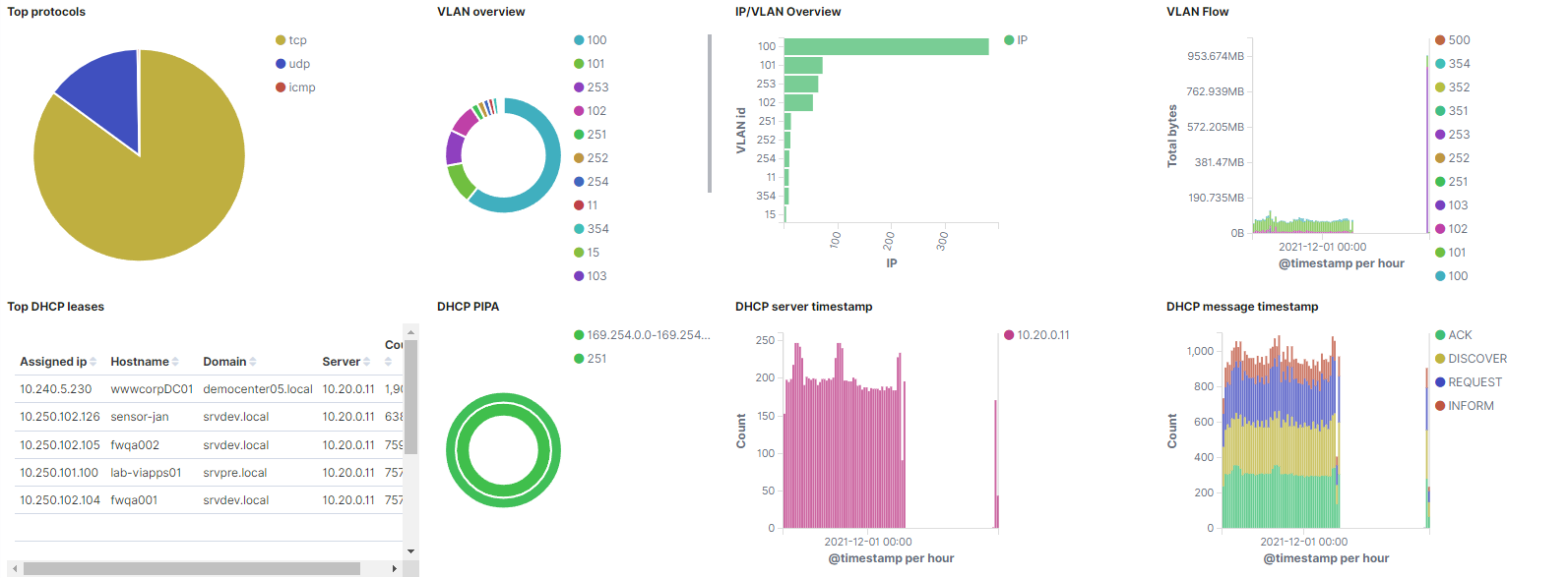
Top protocols: Represents the percentage of the events from protocols TCP, UDP and ICMP.
IP/VLAN Overview: Shows the number of IP detected in each VLAN.
VLAN overview: Represents the percentage of events per VLAN.
VLAN Flow: Shows the data bytes of the VLAN traffic, separated by VLAN on a timeline.
Top DHCP leases: Shows a table with DHCP leases events. This table represetns the assigned IP, as well as the hostname, the domain, the DHCP server, and the amount of times this event is repeated.
DHCP PIPA: The internal pie represents the percentage of the DHCP PIPA IP ranges. These are the IPs that are assigned when a DHCP server is not in range. The external pie represents the percentage of VLANs where the DHCP PIPA has been assigned.
DHCP server timestamp: Shows all the DHCP events, separated by destination IP on a timeline.
DHCP message timestamp: Shows all the DHCP events, separated by DHCP message on a timeline.
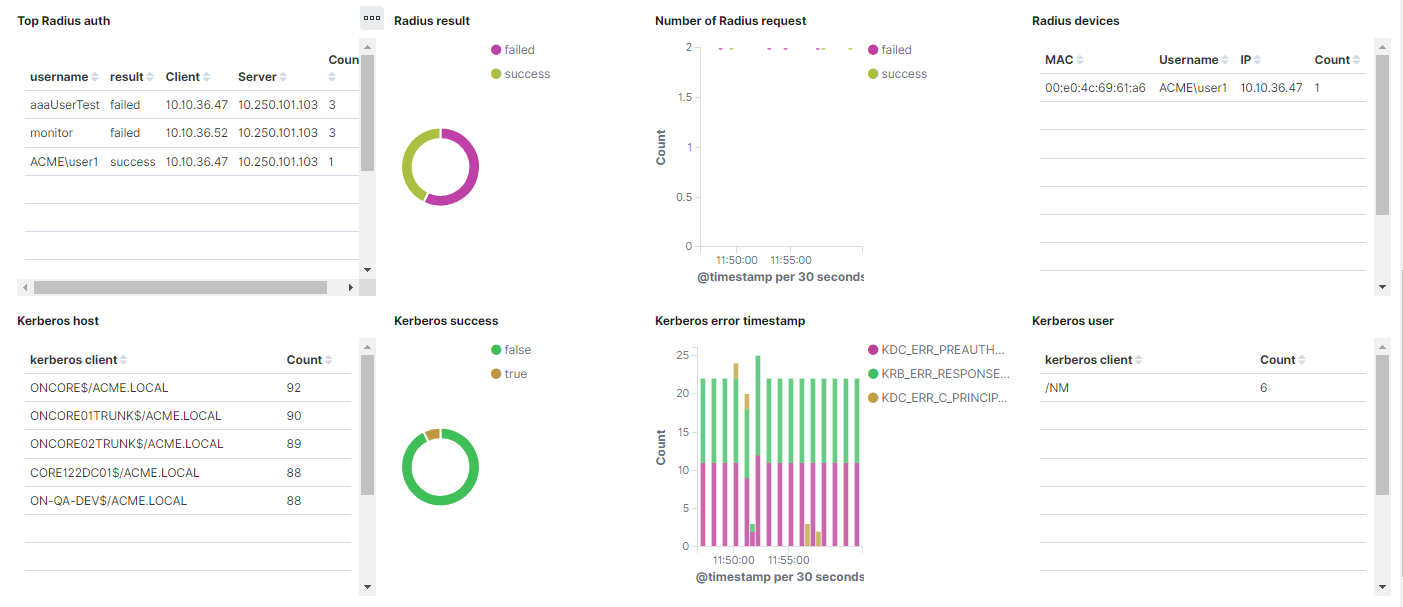
Top radius auth: Shows a table with Radius authorization events. In this table it’s represented the username, the result, the client IP, the server IP, and the amount of times this event is repeated.
Radius result: Represents the percentage of success and failed Radius authentications.
Number of Radius request: Shows the Radius events, separated by success or failed on a timeline.
Radius devices: Shows a table with Radius devices. This table displays the MAC, the username, the IP, and the amount of times this event is repeated.
Kerberos host: Shows a table with Kerberos hosts. This table displays the Kerberos host and the hosts event counts.
Kerberos success: Represents the percentage of success and failed Kerberos events.
Kerberos error timestamp: Shows the Kerberos events, separated by Kerberos error message on a timeline.
Kerberos user: Shows a table with Kerberos users. This table displays the Kerberos host and the users event counts.
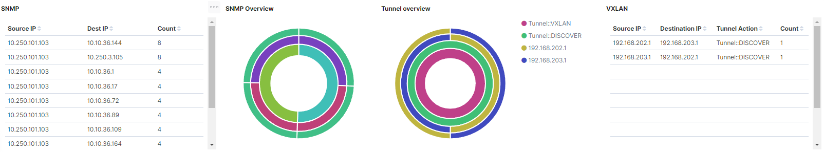
SNMP: Shows a table with SNMP events. This table represents the source IP, the destination IP, and the amount of times this event is repeated.
SNMP Overview: The internal pie represents the percentage of SNMP versions. The middle pie represents the percentage of SNMP community for every SNMP version. The external pie represents the percentage of source IP for every SNMP community..
Tunnel overview: The internal pie represents the percentage of the Tunnel type. The second pie represents the percentage of the Tunnel actions for every Tunnel type. The third pie, the percentage of the destination IPs actions for every Tunnel action. In the external pie, the percentage of source IPs for every destination IP is shown.
VXLAN: Shows a table with VXLAN events. This table displays the source IP, the destination IP, the Tunnel action, and the count of each event.
4.1.6.5.4.5. Web protocols
This window displays views of the web protocol logs captured by the ON Sensors. These protocols are DNS (Domain Name System), HTTP (HyperText Transfer Protocol), SSH (Secure SHell), SSL (Secure Sockets Layer), and Certificate.
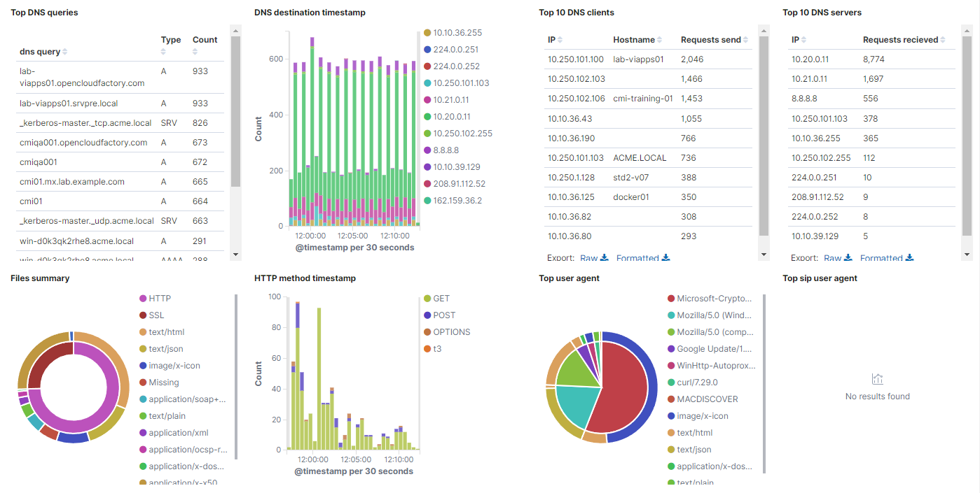
Top DNS queries: Shows a table with DNS events. The table, for each event, includes the dns query, the type, and the amount of times this event is repeated.
DNS destination timestamp: Shows the DNS events, separated by the destination IP on a timeline.
Top 10 DNS clients: Shows a table with the top 10 DNS clients. The table, for each event, includes the dns client IP, the hostname, and the requests send.
Top 10 DNS servers: Shows a table with the top 10 DNS servers. The table, for each event, includes the dns server IP, and the requests received.
Files summary: In the internal pie, it is represented the percentage of the file sources. In the external pie, the percentage of MIME types for every file source is shown.
HTTP method timestamp: Shows over time the HTTP events, separated by the HTTP method.
Top user agent: In the internal pie, the percentage of HTTP user agents is shown. In the external pie, the percentage of http response MIME types for every HTTP user agent is represented.
Top SIP user agent: Represents the percentage of SIP user agents types.
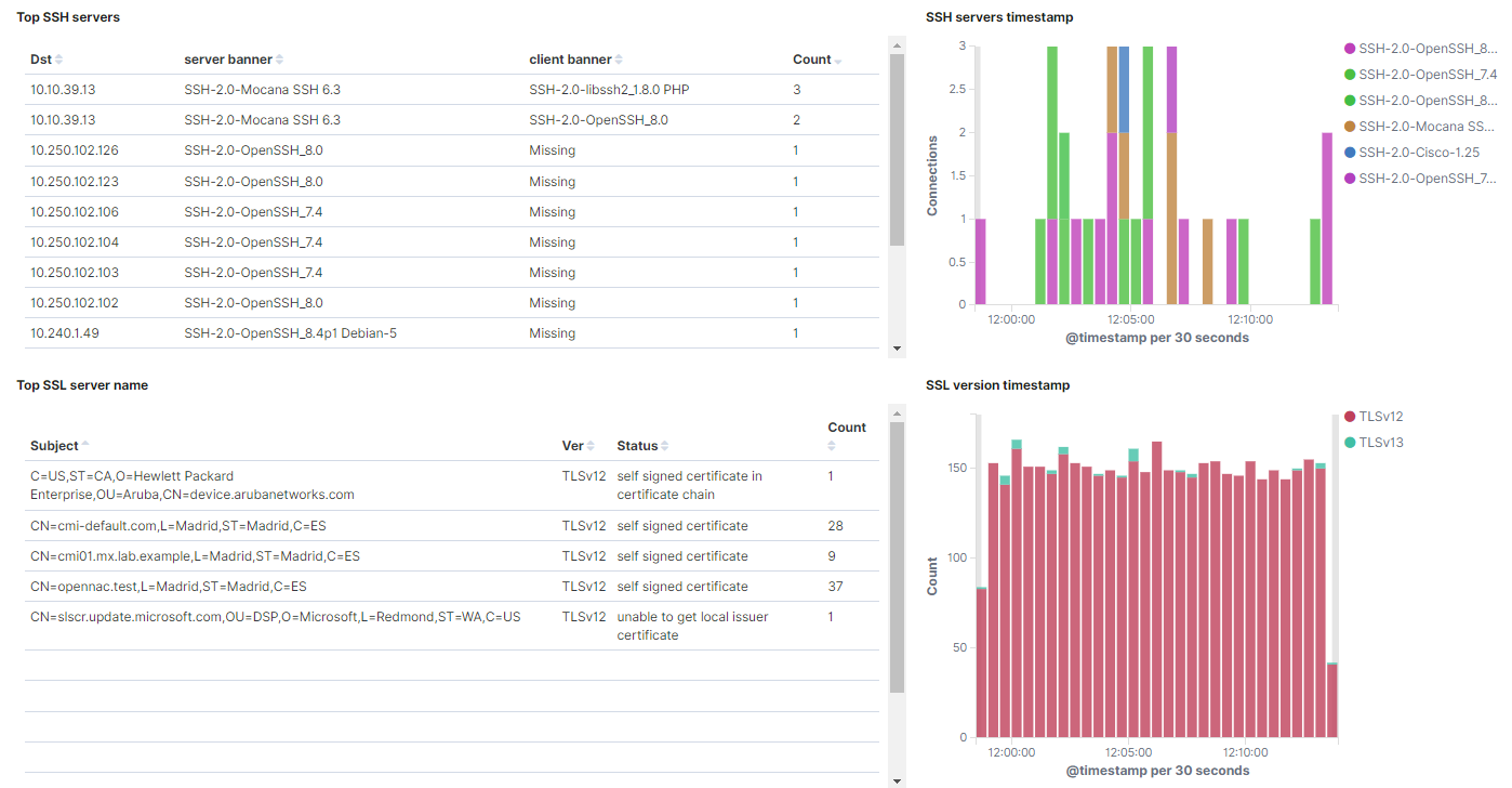
Top ssh servers: Shows a table with the top SSH servers. The table, for each event, includes the destination IP, the server banner, the client banner, and the amount of times this event is repeated.
SSH servers timestamp: Shows over time the SSH events, separated by the SSH server.
Top SSL server name: Shows a table with the top SSL servers subjects. The table, for each event, includes the SSL subject, the SSL version, the status, and the amount of times this event is repeated.
SSL version timestamp: Shows over time the SSL events, separated by the SSL version.
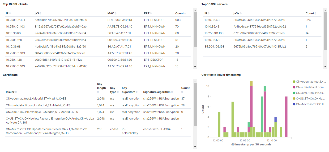
Top 10 SSL clients: Shows a table with the top 10 SSL clients. The table, for each event, includes the client IP, the ja3 (client fingerprint), the MAC, the EPT type, and the amount of times this event is repeated.
Top 10 SSL servers: Shows a table with the top SSL servers. The table, for each event, includes the server IP, the ja3s (server fingerprint), and the amount of times this event is repeated.
Certificate: Shows a table with the top certificate issuers. The table, for each event, includes the certificate issuer name, the key length, the key type, the key algorithm, the signature algorithm, and the amount of times this event is repeated.
Certificate issuer timestamp: Shows when the certificates are used, separated by the certificate issuer on a timeline.
4.1.6.5.4.6. Industrial protocols
The Industrial Potocols window displays views of the industrial protocol logs captured by the ON Sensors. These protocols are Bacnet (Building Automation and Control NETworks), ENIP (EtherNet/IP), Profinet (PROcess FIeld NETwork), Modbus, S7comm (Siemens S7 communication), DNP3 (Distribution Network Protocol version 3).
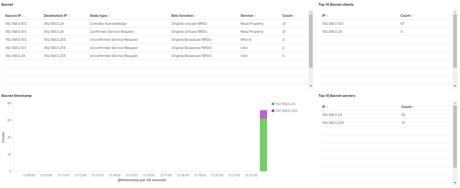
Bacnet: Shows a table with the Bacnet events. The table, for each event, includes the source IP, the destination IP, the abdu type, the bvlc function, the service, and the amount of times this event is repeated.
Top 10 Bacnet clients: Shows a table with the top 10 Bacnet clients. The table, for each event, includes the client IP and the amount of times this event is repeated.
Bacnet timestamp: Shows over time the Bacnet event, separated by destination IP.
Top 10 Bacnet servers: Shows a table with the top 10 Bacnet servers. The table, for each event, includes the server IP and the amount of times this event is repeated.
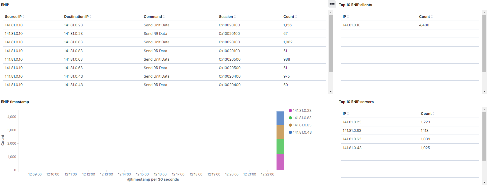
ENIP: Shows a table with the ENIP events. The table, for each event, includes the source IP, the destination IP, the command, the session ID, and the amount of times this event is repeated.
Top 10 ENIP clients: Shows a table with the top 10 ENIP clients. The table, for each event, includes the client IP and the amount of times this event is repeated.
ENIP timestamp: Shows over time the ENIP event, separated by destination IP.
Top 10 ENIP servers: Shows a table with the top 10 ENIP servers. The table, for each event, includes the server IP and the amount of times this event is repeated.
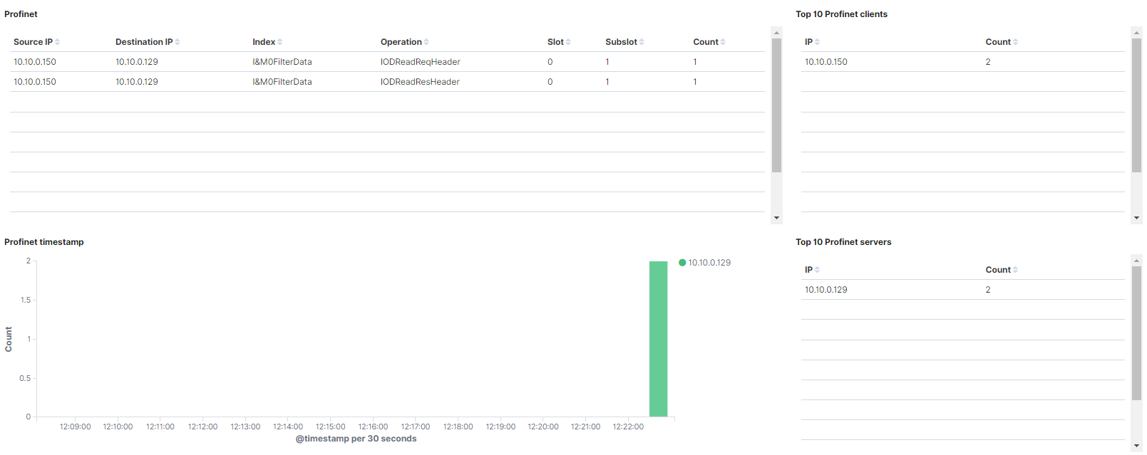
Profinet: Shows a table with the Profinet events. The table, for each event, includes the source IP, the destination IP, the index, the operation, the slot, the subslot, and the amount of times this event is repeated.
Top 10 Profinet clients: Shows a table with the top 10 Profinet clients. The table, for each event, includes the client IP and the amount of times this event is repeated.
Profinet timestamp: Shows over time the Profinet event, separated by destination IP.
Top 10 Profinet servers: Shows a table with the top 10 Profinet servers. The table, for each event, includes the server IP and the amount of times this event is repeated.
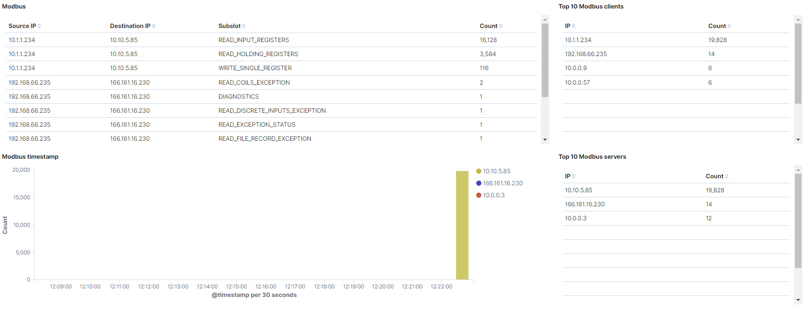
Modbus: Shows a table with the Modbus events. The table, for each event, includes the source IP, the destination IP, the modbus function, and the amount of times this event is repeated.
Top 10 Modbus clients: Shows a table with the top 10 Modbus clients. The table, for each event, includes the client IP and the amount of times this event is repeated.
Modbus timestamp: Shows over time the Modbus event, separated by destination IP.
Top 10 Modbus servers: Shows a table with the top 10 Modbus servers. The table, for each event, includes the server IP and the amount of times this event is repeated.
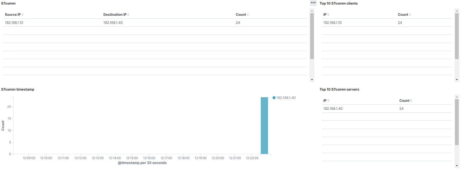
S7comm: Shows a table with the s7comm events. The table, for each event, includes the source IP, the destination IP, and the amount of times this event is repeated.
Top 10 S7comm clients: Shows a table with the top 10 s7comm clients. The table, for each event, includes the client IP and the amount of times this event is repeated.
S7comm timestamp: Shows over time the s7comm event, separated by destination IP.
Top 10 S7comm servers: Shows a table with the top 10 s7comm servers. The table, for each event, includes the server IP and the amount of times this event is repeated.
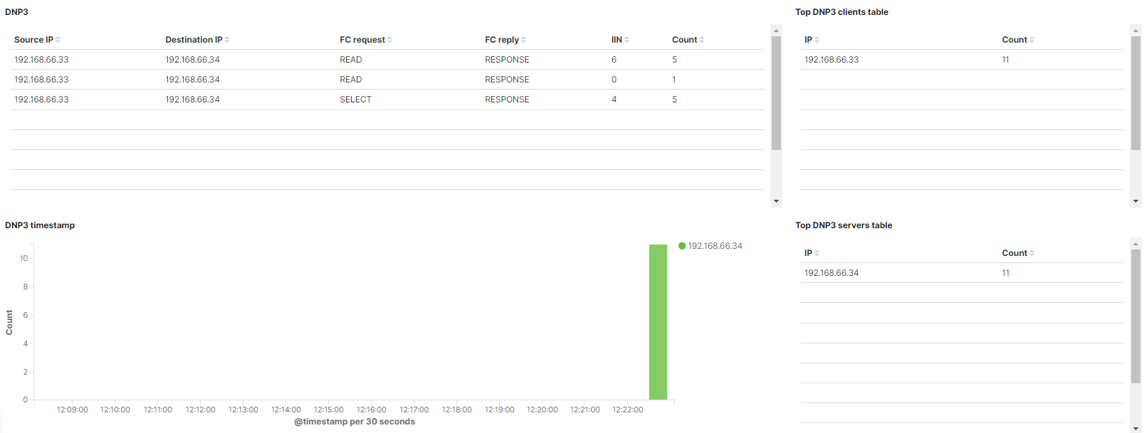
DNP3: Shows a table with the DNP3 events. The table, for each event, includes the source IP, the destination IP, the fc request, the fc reply, the IIN, and the amount of times this event is repeated.
Top DNP3 clients table: Shows a table with the top 10 DNP3 clients. The table, for each event, includes the client IP and the amount of times this event is repeated.
DNP3 timestamp: Shows over time the DNP3 event, separated by destination IP.
Top DNP3 servers table: Shows a table with the top 10 DNP3 servers. The table, for each event, includes the server IP and the amount of times this event is repeated.
4.1.6.5.4.7. Other protocols
The Other protocols window displays other protocol logs captured by the ON Sensors that do not match in the other windows. These protocols are DPD (Dynamic Protocol Detection), Syslog (System Logging Protocol) and FTP (File Transfer Protocol).
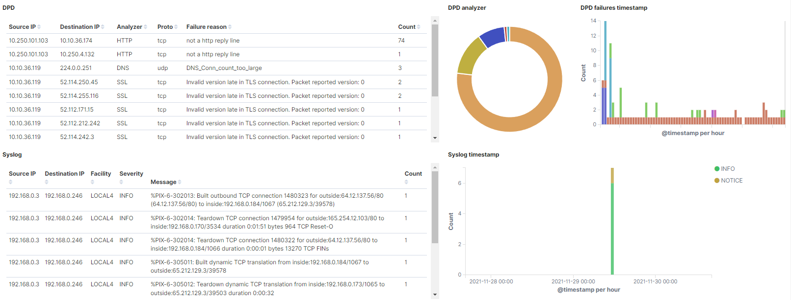
DPD: Shows a table with the DPD events. The table, for each event, includes the source IP, the destination IP, the analyzer, the protocol type, the failure reason, and the amount of times this event is repeated.
DPD Analyzer: Represents the percentage of the DPD analyzers detected.
DPD failures: Shows over time the DPD event, separated by the failure reason.
Syslog: Shows a table with the syslog events. The table, for each event, includes the source IP, the destination IP, the facility, the severity, the message, and the amount of times this event is repeated.
Syslog timestamp: Shows over time the syslog events, separated by destination severity.
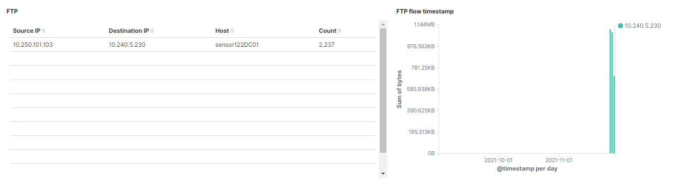
FTP: Shows a table with the FTP events. The table, for each event, includes the source IP, the destination IP, the source host, and the amount of times this event is repeated.
FTP flow timestamp: Shows over time the data bytes of the FTP traffic, separated by destination IP.
4.1.6.5.4.8. Location
The Location window displays views about the location of the logs captured by the ON Sensors.
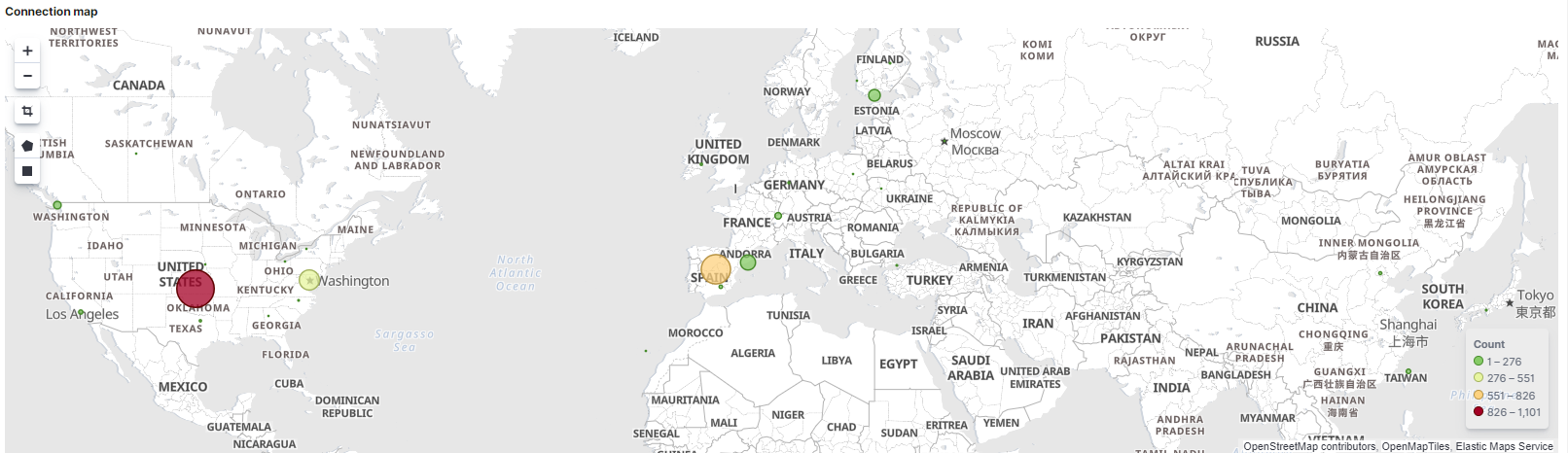
Connection map: Shows in a map from what part of the world is the traffic coming, and depending of the traffic density, the circle is bigger or smaller.
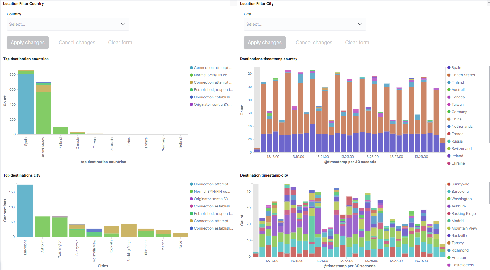
Location filter country: Allows to filter by country Name.
Location filter city: Allows to filter by city Name.
Top destination countries: Shows the top 10 destination countries with the count of events from this country in the Y axis. The count of events is separated by the connection state.
Destination timestamp country: Shows all the bro events with location, separated by destination country on a timeline.
Top destination city: Shows the top 10 destination cities with the count of events from this city in the Y axis. The count of events is separated by the connection state.
Destination timestamp city: Shows all the bro events with location, separated by destination city on a timeline.
4.1.6.5.5. Network X-Ray
Network X-Ray allows us to see the interactions between devices through communication relationships between IPs.
We can find this dashboard in Analytics -> Sensor -> Network X-Ray.
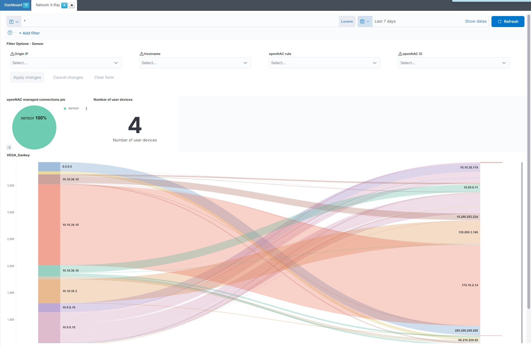
Filter Options - Sensor: Allows to filter by the origin IP, the hostname, the OpenNAC Enterprise policy rule and the OpenNAC Enterprise ID.
openNAC managed connections pie: Represents the percentage of the bro connections managed, coming from the sensor, and not managed.
Number of user devices: Shows the number of user devices in the network.
VEGA_Sankey: Shows the connection flows between the different devices in the network.
4.1.6.5.6. Visibility & Discovery
The Visibility & Discovery dashboard shows us the assets connected to the network in a summarized way. This information is segmented by type of device and operating system .
We can find this dashboard in Analytics -> Use Cases -> Visibility & Discovery.
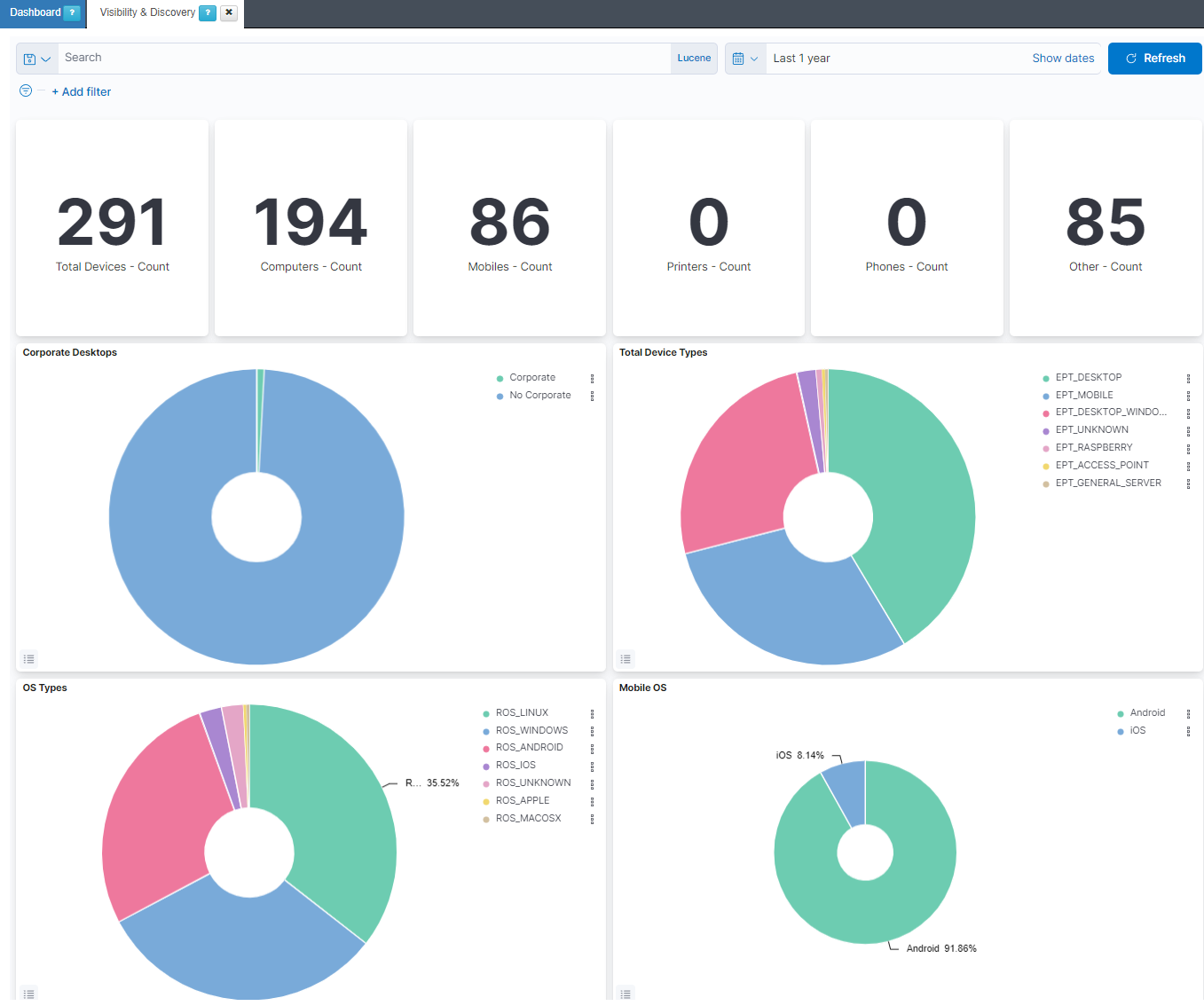
Total Devices: Shows the number of total devices in the network.
Computers: Shows the number of total computers in the network.
Mobiles: Shows the number of total mobiles in the network.
Printers: Shows the number of total printers in the network.
Phones: Shows the number of total phones in the network.
Other: Shows the number of the other devices in the network.
Corporate Desktops: Represents the percentage of corporate devices and no corporate devices.
Total Device Types: Represents the percentage of EPT (END POINT TYPE) tags.
OS Types: Represents the percentage of the operating systems from all the devices in the network.
Mobile OS: Represents the percentage of the operating systems from the mobiles in the network.
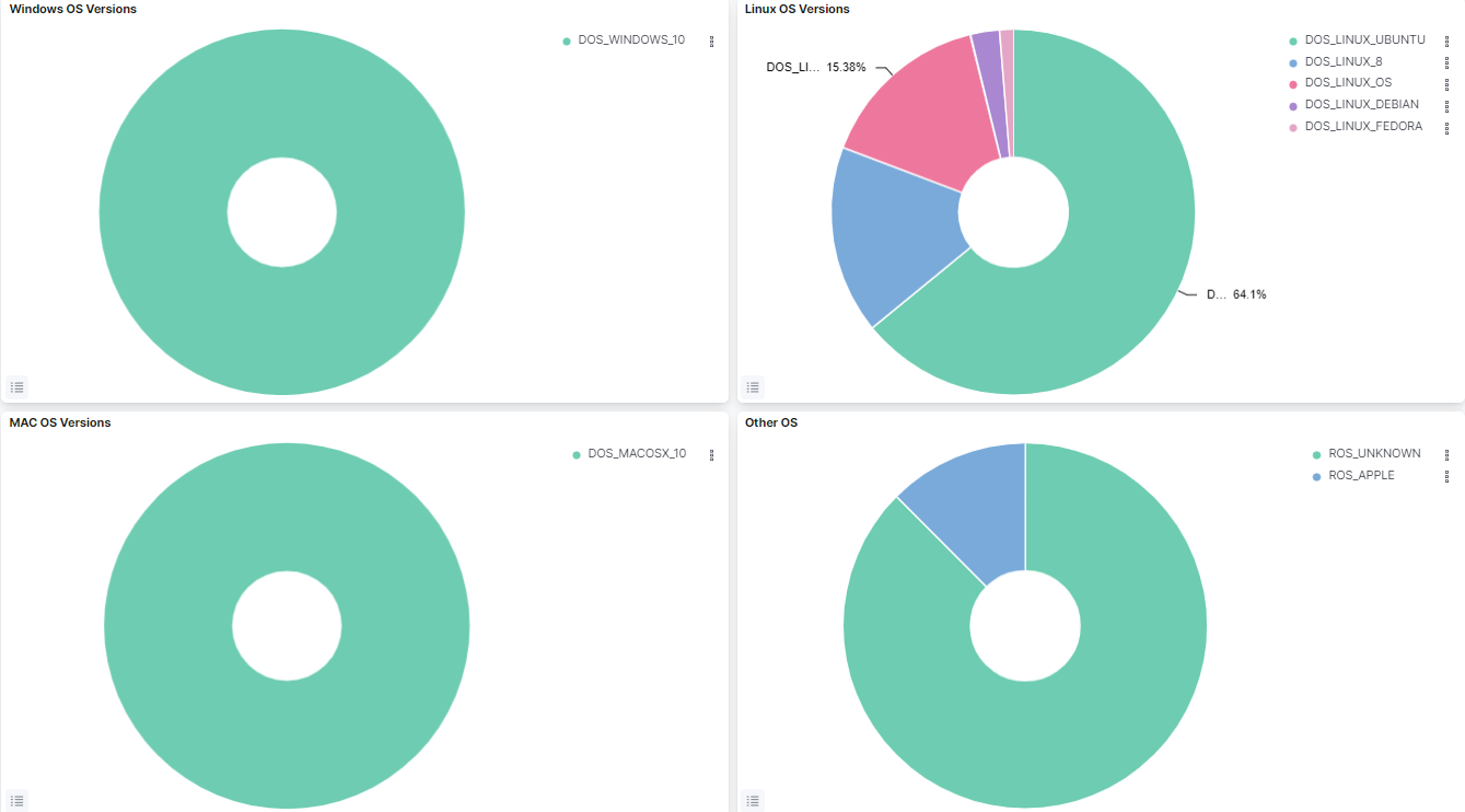
Windows OS Versions: Represents the percentage of the Windows versions found in the network.
Linux OS Versions: Represents the percentage of the Linux versions found in the network.
MAC OS Versions: Represents the percentage of the MAC OS versions found in the network.
Other OS: Represents the percentage of the other operating systems found in the network.
4.1.6.6. Dashboards Filtering
In all the dashboards of the solution there is an upper bar that allows you to temporary filter the information displayed in the graphs and tables of the dashboard.

4.1.6.6.1. Variable filtering
In this bar we can add new filters by clicking on “+ Add filter”.
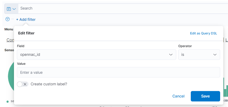
Here we can add the variable we want to filter by, for example, time, id, type, and others. Once the variable is selected, we must indicate the operator, is, is not, etc. Depending on whether we want to search for a specific variable, ignore a specific variable in the graph and others. Finally, we indicate the value of the variable and save the filter by clicking on “Save”.
If within a dashboard we press any variable that is in a graph, a filter will be generated with that same variable that will affect the overall dashboard.
4.1.6.6.2. Time period filtering
To quickly filter, we can select the calendar icon. This will open a dropdown menu where we can configure the time period of the dashboard.
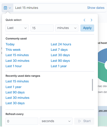
In the first section (Quick select), we can quickly select a time period from the current moment to where it is configured. For example, the last 15 minutes, hours, days, etc.
In the next section (Commonly used), we can select time periods that are frequently used and that are already configured.
In the (Recently used date ranges) section, also using time periods already configured, it will filter the ones we used recently.
The last section corresponds to the refresh rate of the graph (by default disabled). With this, the graph is updated periodically when pressing Start.
If we want to further customize the time period of the graph, we can select each of the times (start and end) in which we can select the exact point.
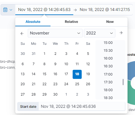
If we select the Absolute type, we will be asked for an exact calendar date. On the other hand, when selecting Relative, we must indicate a period of time from the current moment. If we select Now means that on every refresh the current time will be set to the time of the refresh.
It is important to take into account the rotation of the data. If the data rotation is defined in one month we will only be able to obtain information up to one month before the current moment.