7.3. Customized Dashboards
After reading this section, we will be able to create our own dashboards in Kibana and represent them in OpenNAC Enterprise.
7.3.1. Access Development Kibana
To access the Kibana development environment, use the following path:
https://<CORE_IP_OR_DOMAIN>/admin/rest/elasticsearch/app/home
Note
You will not be able to see the kibana headers.
7.3.2. Creation of Searches
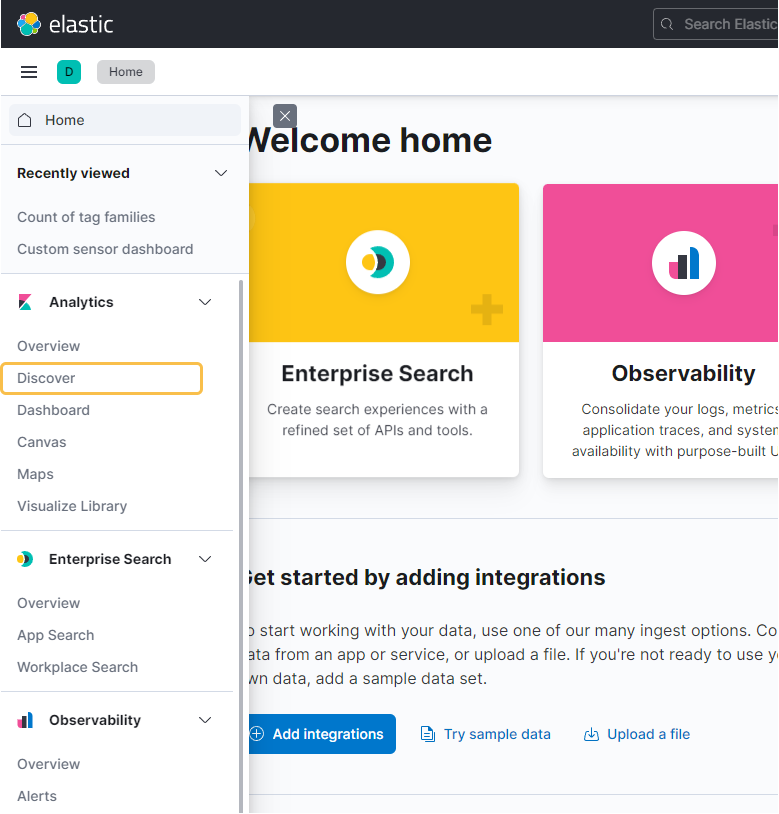
To create a new search, we need to click on the Discover button on the left menu.
We will see something like the following:
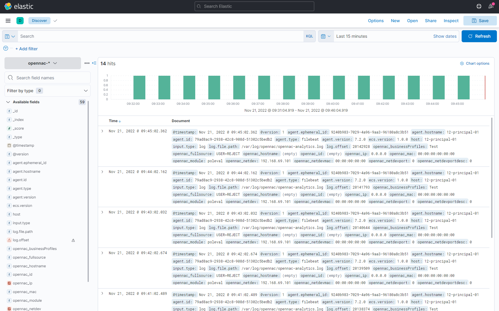
This corresponds to the Analytics -> Discover section of the OpenNAC menu.
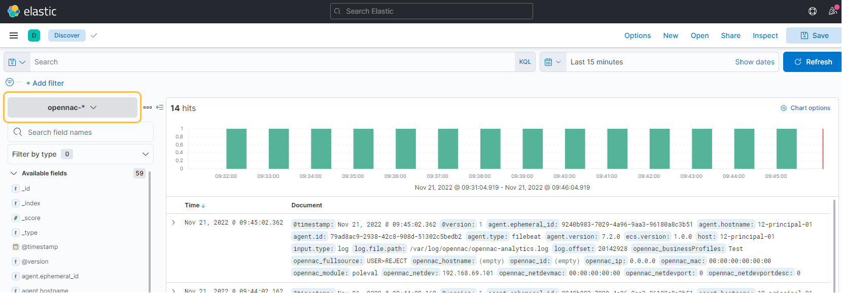
Then, we need to select the index-pattern we desire. We will find the following options:
“bro-*”: Shows all the events captured by the ON Sensor.
“identities”: When anonymization is activated on Logstash, the relation between the hash and the value is found on this index.
“opennac-*”: Shows all the events for the user devices that can be enriched with OpenNAC, that means that we have the MAC.
“opennac_captive-*”: Shows all the events on the Captive Portal.
“opennac_macport-*”: Shows all the macport events.
“opennac_nd”: Shows the last event for the network devices.
“opennac_nd-*”: Shows all the events for the network devices.
“opennac_ud”: Shows the last event for the user devices that can be enriched with OpenNAC, that means that we have the MAC.
“radius-*”: Shows all the radius events.
“misc-*”: Shows all the logs that not match with the other index.
“external_syslog-*”: Shows the network events sended by the network devices.
“third_party_vpn”: Shows all the events related to the Third Party VPN use case.
“vpngw-*”: Shows all the events related with VPNGW module.
For example, in this case, we are going to create a search in the index bro-*. Our search is going to show all the ON Sensor events that can’t be discovered by OpenNAC Enterprise because we don’t have the MAC of the device.
There are different types of logs for bro-* index. First , we need to know what value to filter. The Data Lake should help us with that.
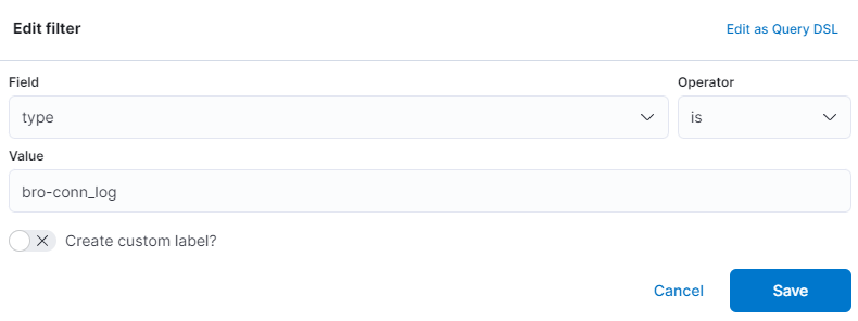
We are going to look for the connection logs. For that, we need to create a filter.

The filter will only show the hits where type is bro-conn_log.
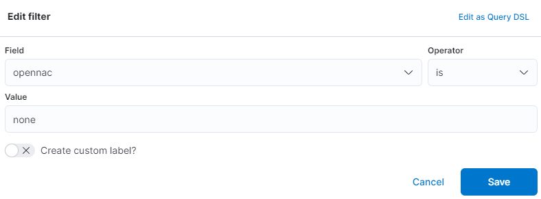
In this case, to know all the ON Sensor events that can’t be discovered by the OpenNAC Enterprise, the best field to use is opennac. To create this filter, fill in the fields with the following values.
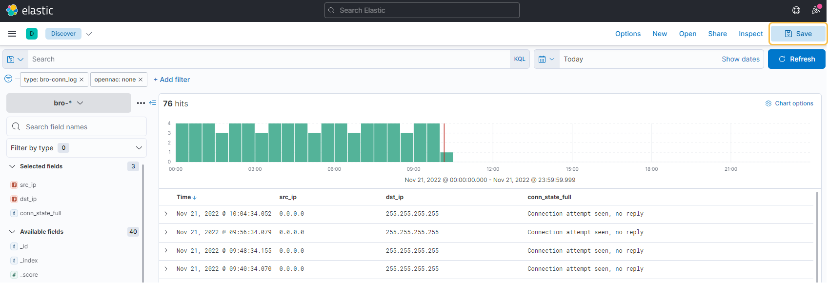
Imagine that we want to see the source IP, the destination IP, and the connection state. To do that, we need to open one hit and look for the fields that contain this information. When we find them, click on the table icon in the lower left corner of the screen.
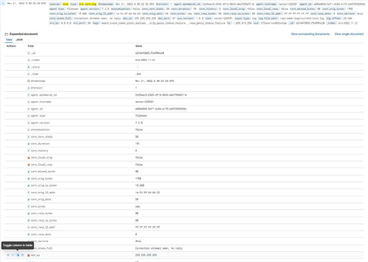
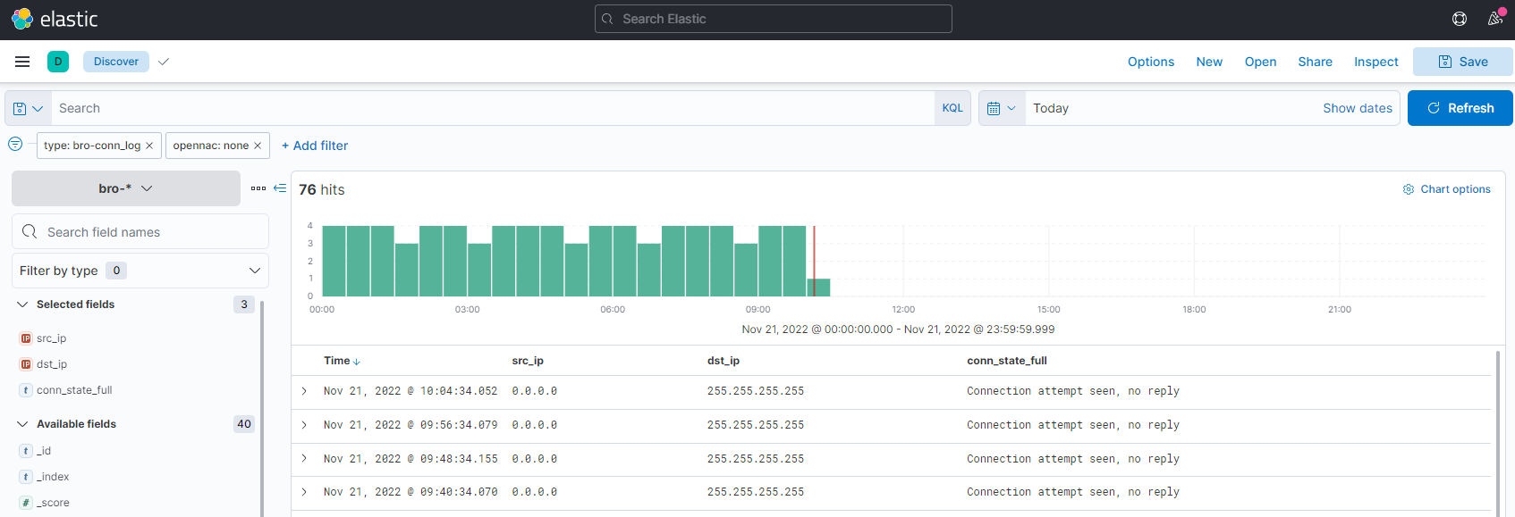
The fields that we want to show are: src_ip, dst_ip and conn_state_full. The result of our search is the following:
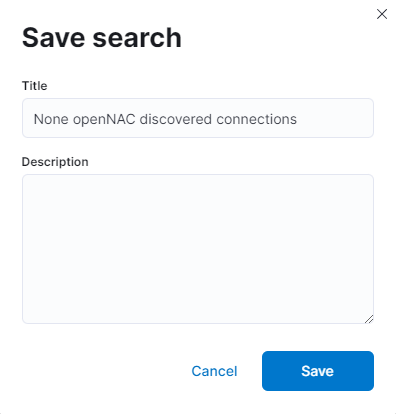
To save our search, we need to click on the save button in the upper right corner of the screen.
We need to enter the name we want for the search.
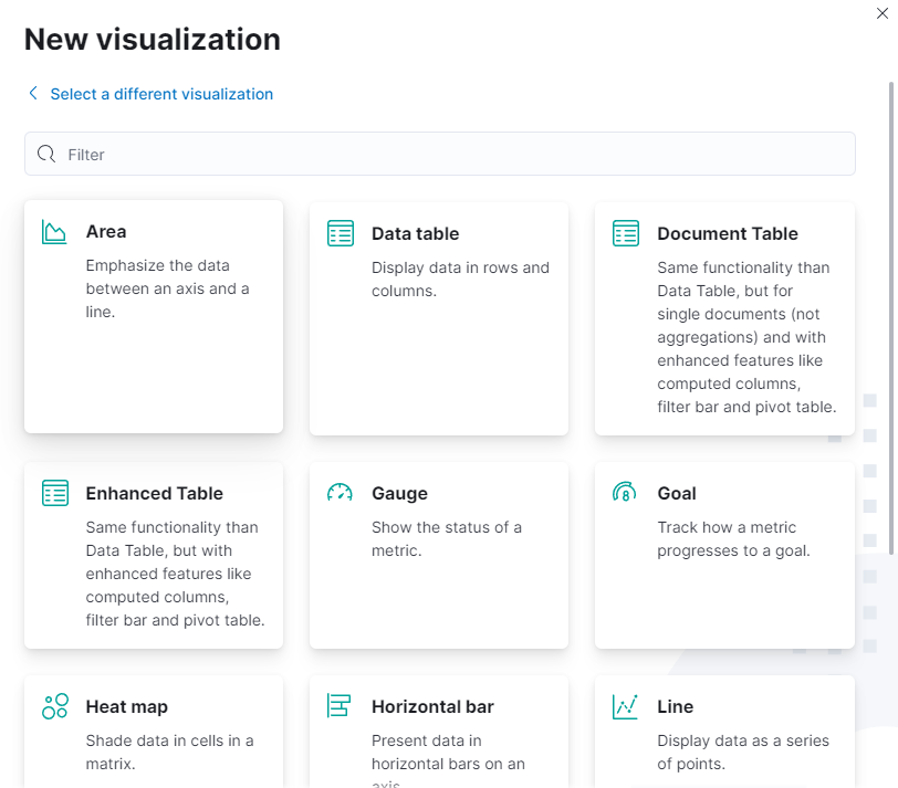
7.3.3. Creation of Visualizations
To create a new visualization, we need to click on the Visualize button on the left menu.

We will see something like the following:
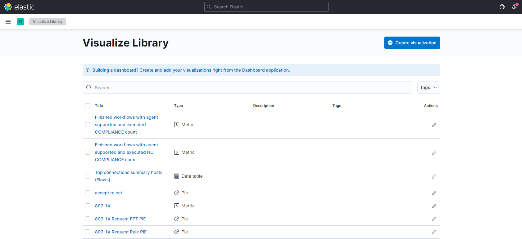
All the visualizations we have in our Kibana are listed. To create a new one, click on Create new visualization and see all the different visualization-type available.
The different options to create visualizations are the following:
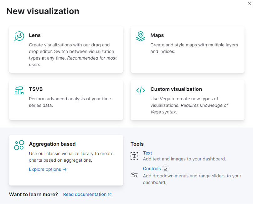
Lens: To create a visualization, drag the data fields you want to visualize to the workspace. Then Lens will use visualization best practices to apply the fields and create a visualization that best displays the data.
With Lens, you can:
Create area, line, and bar charts with layers to display multiple indices and chart types.
Change the aggregation function to change the data in the visualization.
Perform math on aggregations using Formula.
Use time shifts to compare the data in two-time intervals, such as month over month.
Create custom tables.
Maps: Create beautiful maps from your geographical data. With Maps, you can:
Build maps with multiple layers and indices.
Animate spatial temporal data.
Upload GeoJSON.
Embed your map in dashboards.
Symbolize features using data values.
Focus on only the data that’s important to you.
TSVB: TSVB is a set of visualization types that you configure and display on dashboards.
With TSVB, you can:
Combine an infinite number of aggregations to display your data.
Annotate time series data with timestamped events from an Elasticsearch index.
View the data in several types of visualizations, including charts, data tables, and markdown panels.
Display multiple index patterns in each visualization.
Use custom functions and some math on aggregations.
Customize the data with labels and colors.
Custom visualization: Vega and Vega-Lite are both grammars for creating custom visualizations. They are recommended for advanced users who are comfortable writing Elasticsearch queries manually. Vega-Lite is a good starting point for users who are new to both grammars, but they are not compatible.
Vega and Vega-Lite panels can display one or more data sources, including Elasticsearch, Elastic Map Service, URL, or static data. They also support Kibana extensions that allow you to embed the panels on your dashboard and add interactive tools.
Use Vega or Vega-Lite when you want to create visualizations with:
Aggregations that use nested or parent/child mapping
Aggregations without an index pattern
Queries that use custom time filters
Complex calculations
Extracted data from _source instead of aggregations
Scatter charts, sankey charts, and custom maps
An unsupported visual theme
These grammars have some limitations: they do not support tables and can’t run queries conditionally.
Aggregation based: Aggregation-based visualizations are the core Kibana panels and are not optimized for a specific use case.
With aggregation-based visualizations, you can:
Split charts up to three aggregation levels, which is more than Lens and TSVB
Create visualization with non-time series data
Use a saved search as an input
Sort data tables and use the summary row and percentage column features
Assign colors to data series
Extend features with plugins
Aggregation-based visualizations include the following limitations:
Limited styling options
Math is unsupported
Multiple indices is unsupported
To know more about the visualization types, we can visit the elastic documentation.
In our case, we will use the Aggregation based option. This option allows the following types of visualizations:
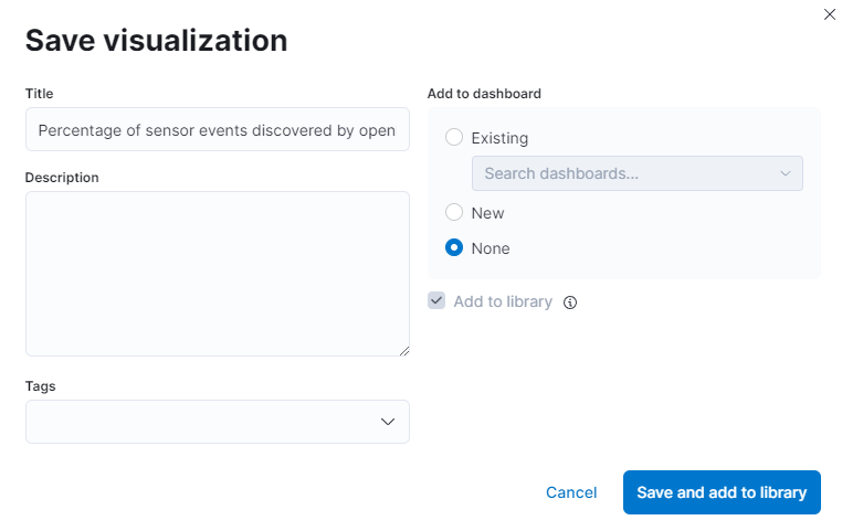
7.3.3.1. Percentage of Sensor events discovered by OpenNAC
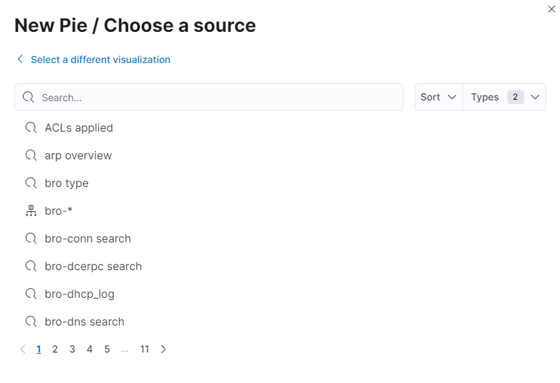
First, create a visualization that shows the percentage of events discovered by OpenNAC Enterprise for bro-* index. To do that, select the Pie type and then select the bro-* index-pattern as source.
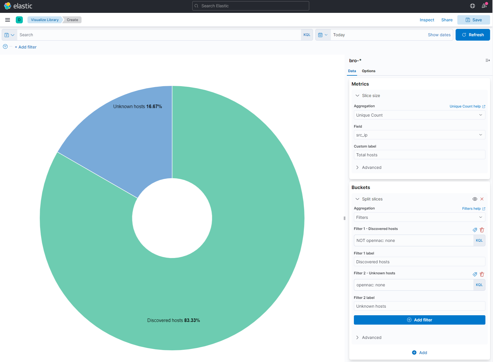
The visualization editor will be displayed:
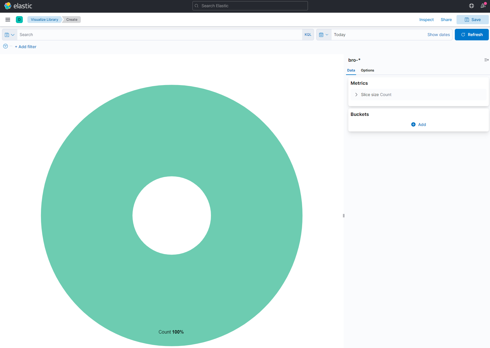
Then in Buckets, we can see that we have a Split Slices where we need to select an Aggregation. The aggregation required is the Filters one.
The following filters need to be applied:
NOT opennac: none -> Discovered events
opennac: none -> Unknown events
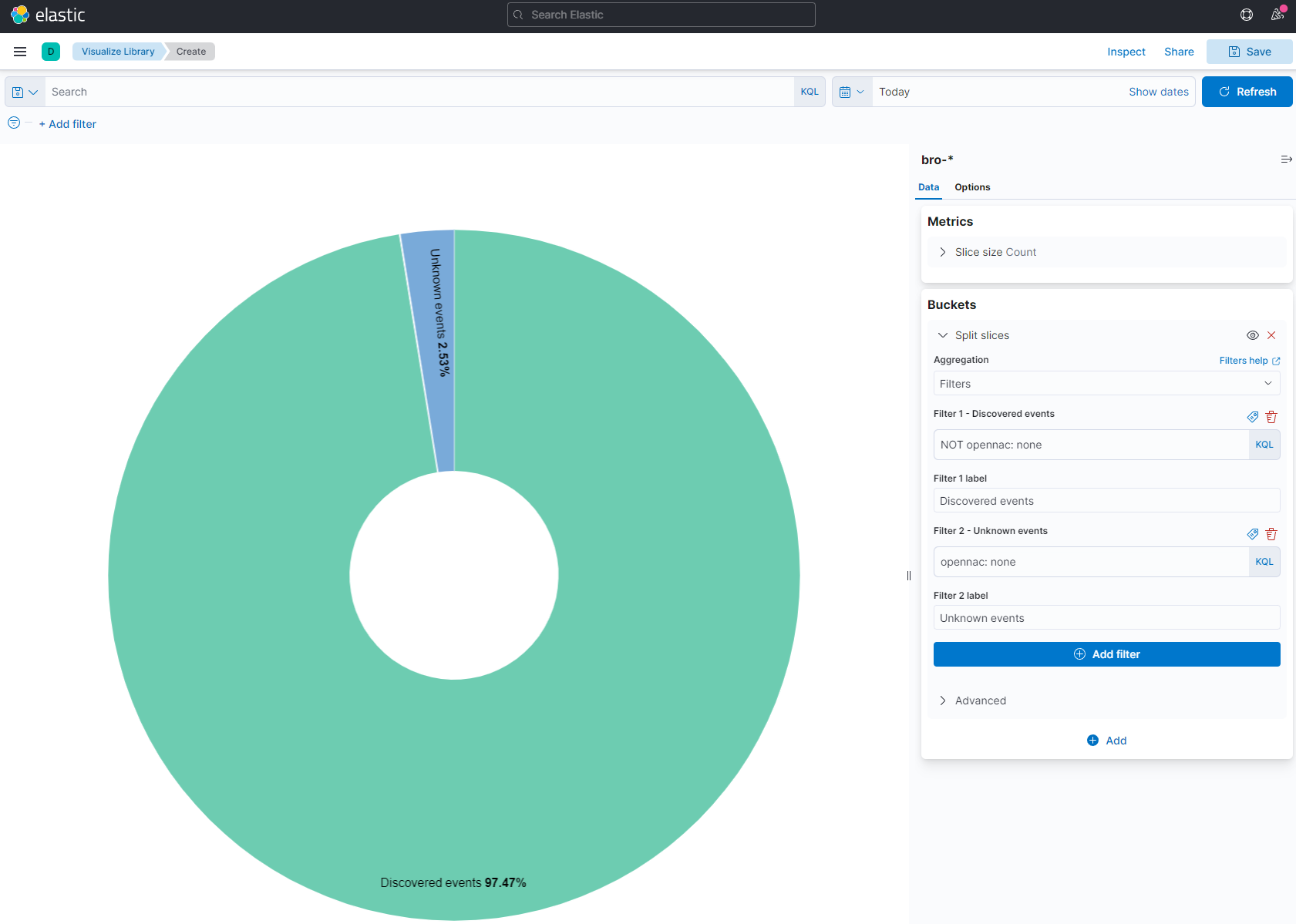
Finally, save the visualization.
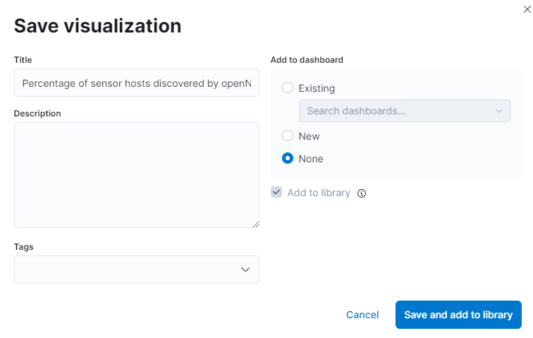
7.3.3.2. Percentage of sensor hosts discovered by OpenNAC
Now, if we don’t want all the events and only the hosts discovered, we need to modify the Metrics. Go to Slice Size and we select the Aggregation type Unique Count. Then, we want a unique count of the different source IPs, so in Field add src_ip. We also need to change the labels.
Finally, save the visualization.
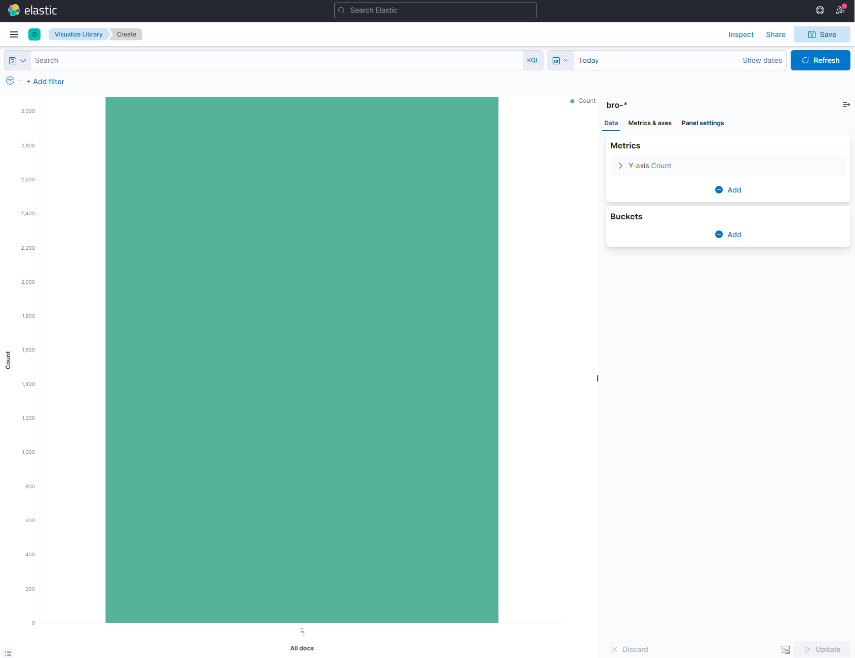
7.3.3.3. Sensor events timestamp by hostname
This visualization will show all the events of the different sensors over time. The events will be separated by sensor hostname.
To do that, select the visualization type Vertical Bar and the index-pattern bro-*. You will see the following:
In the X-Axis, in Aggregation selector, we need to put Date Histogram. Then, in Field selector, we need to put @timestamp. With this, we will have the X axis over time.
To separate the sensor events by host, click on Add sub-buckets and add a Split Series. Then, in Sub aggregation selector, enter Terms and finally, in the Field selector, enter host.keyword.
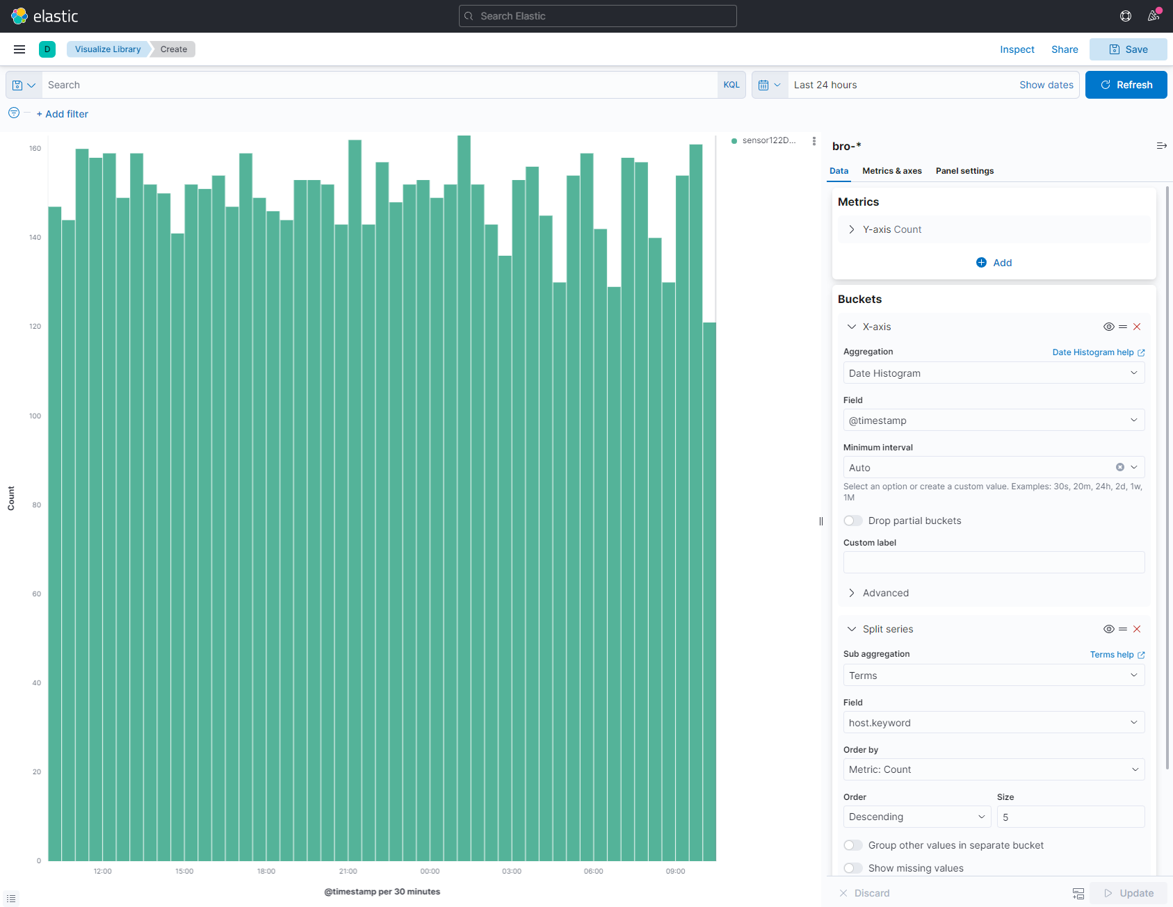
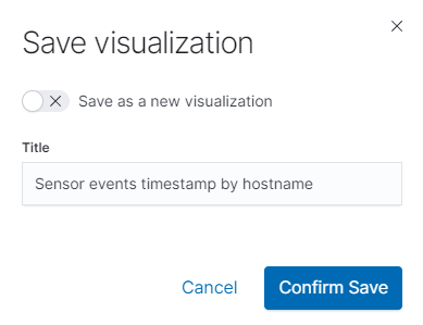
Finally, save the visualization.
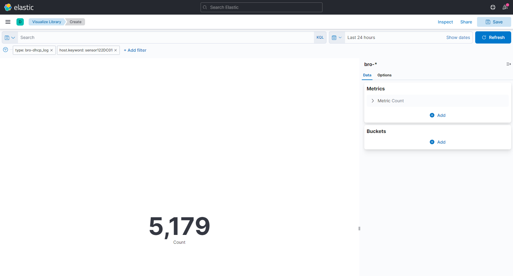
7.3.3.4. Count of DHCP logs captured by the sensor122DC01
This visualization will show the number of hits of DHCP that the sensor has captured.
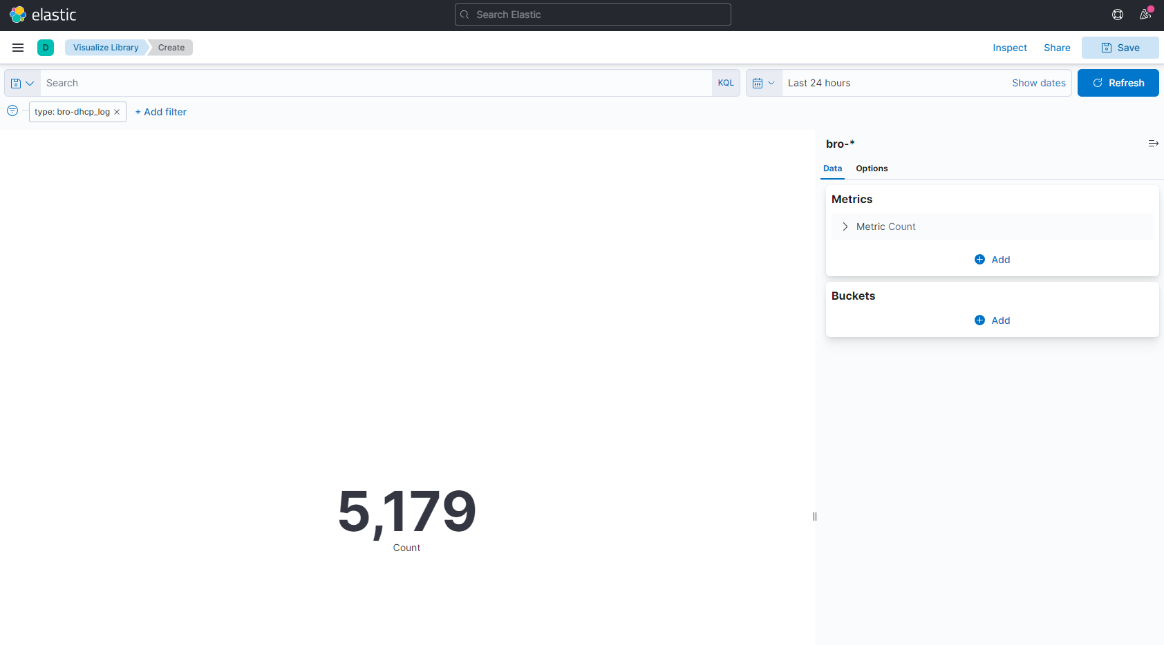
To do that, we need to select the visualization type Metric and the index-pattern bro-*. You will see the following:

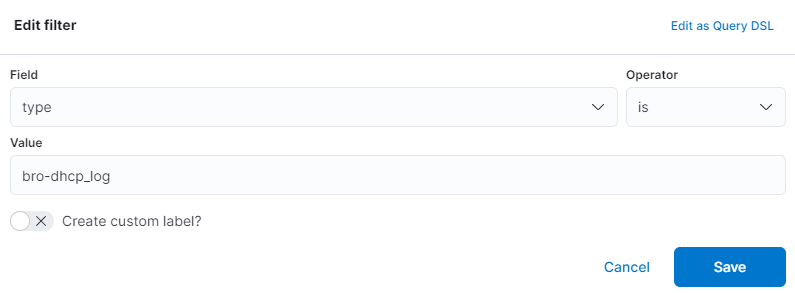
To show only the DHCP logs, filter by type and it need to be equal to bro-dhcp_log.
It will display the number of total DHCP events captured by the different Sensors in the last 90 days.
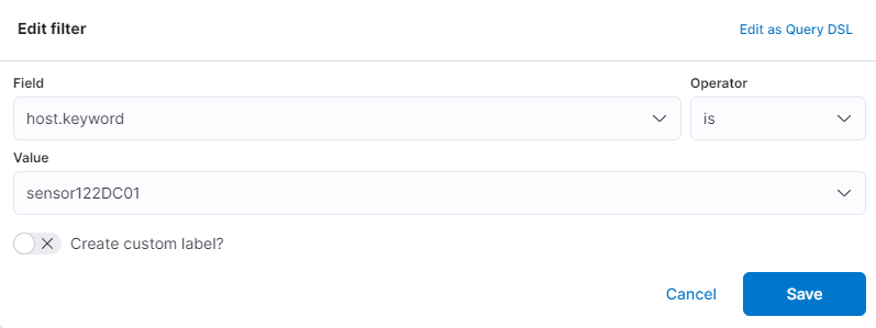
Now, if we only want to show the logs from sensor122DC01, filter by host and it need to be equal to sensor122DC01.
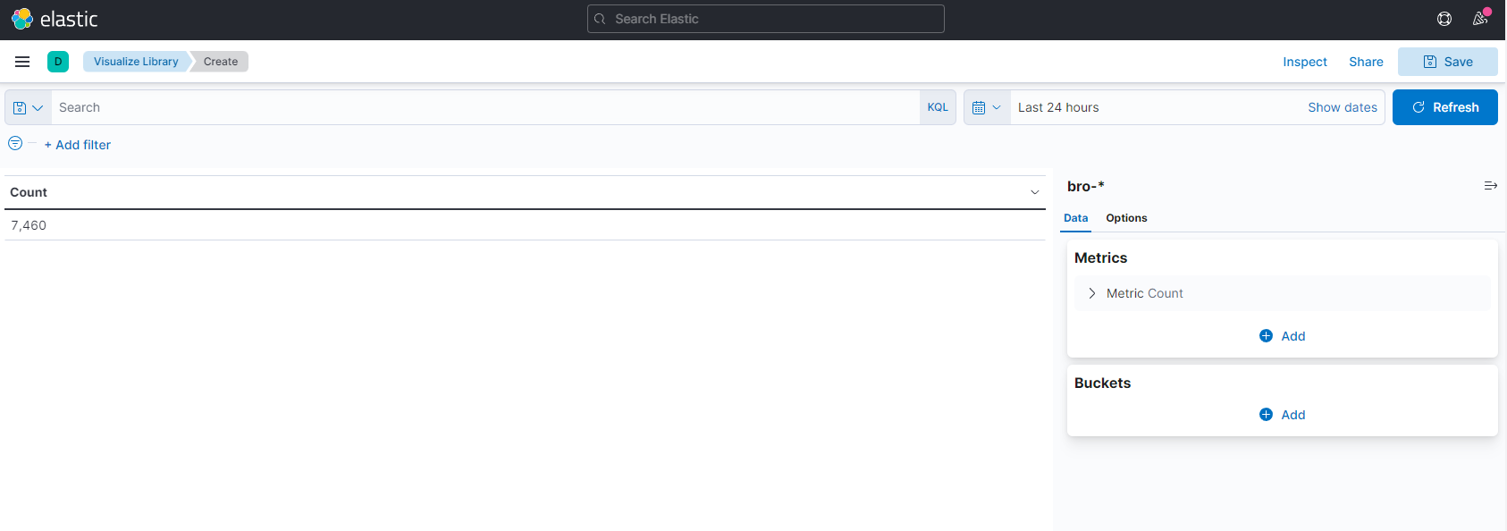
The final result with the total number of DHCP logs captured by the sensor122DC01 is the following:
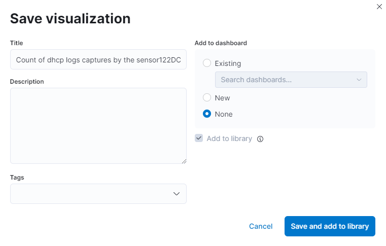
Finally, save the visualization.
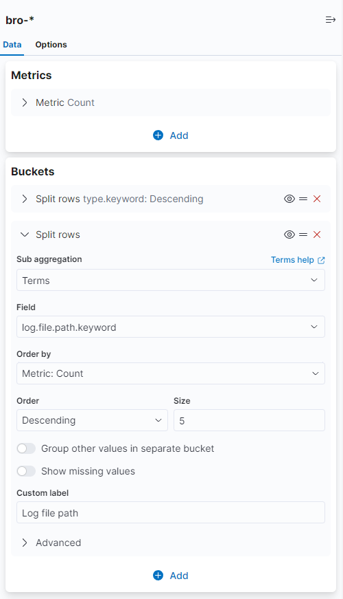
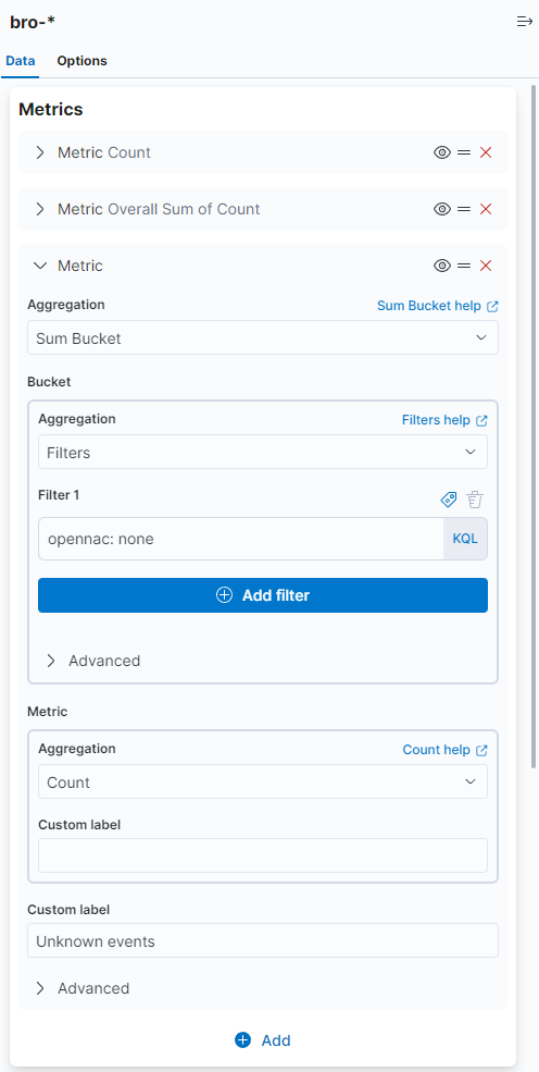
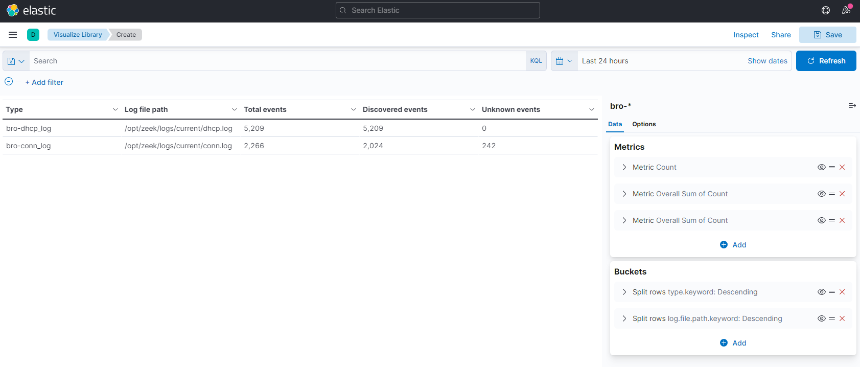
7.3.3.5. Total of bro types
This visualization will show the different types of bro logs, with some information about them represented in a table.
To do that, select the visualization type Data Table and the index-pattern bro-*. You will see the following:
First, separate the table by bro types. In Buckets, add a new Split Rows. In Aggregation selector, select Terms and in Field, select type.keyword.
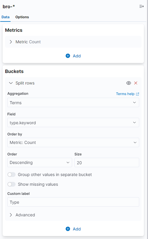
We also want to add the log file path. In Buckets, add a new Split Rows. In Aggregation selector, select Terms and in Field, select log.file.path.keyword.
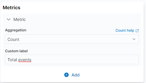
To add the total of events for every type of bro log, go to Metrics, and on Aggregation select Count.
Note
It is created by default.
To add the total of events discovered by OpenNAC Enterprise, go to Metrics and click on Add metrics. In Aggregation, select Sum Bucket, in Sub aggregation select Filters, and finally in Filter1 add NOT opennac: none.
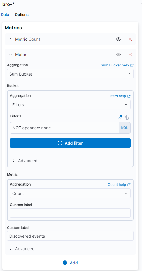
To add the total of events not discovered by OpenNAC Enterprise, go to Metrics and click on Add metrics. In Aggregation, select Sum Bucket, in Sub aggregation, select Filters, and finally in Filter1, add opennac: none.
The result of our table is the following:
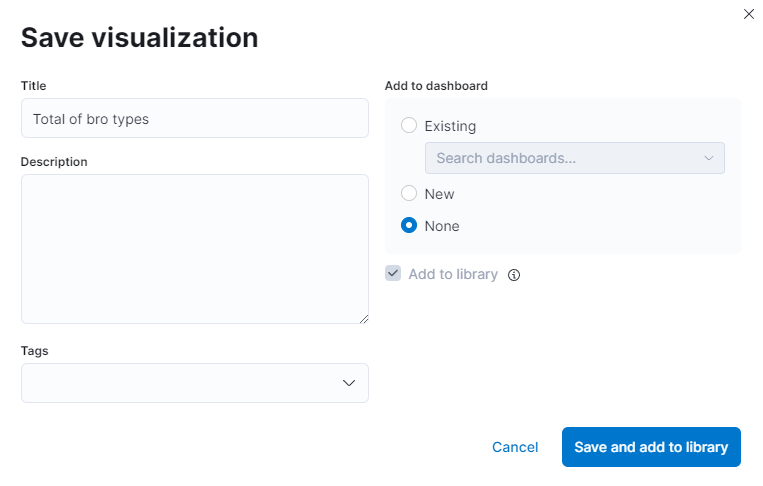
Finally, save the visualization.
7.3.4. Creation of Dashboards
To create a new dashboard, click on the Visualize button on the left menu.

You will see something like the following:
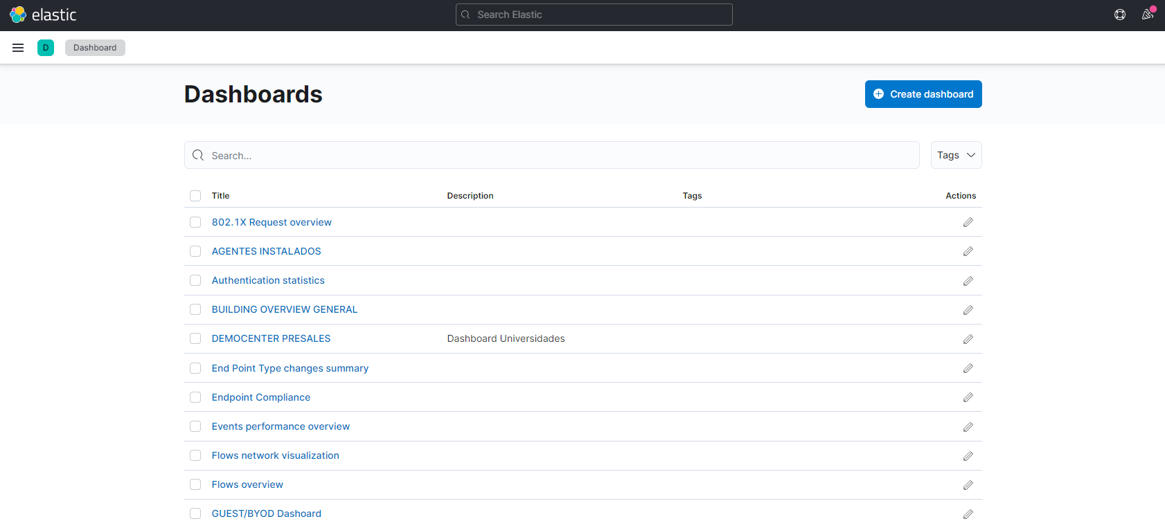
All the dashboards that we have on our Kibana are listed. To create a new one, click on Create new dashboard and we will see the dashboard editor.

If we click on the Add from library button, we can add visualizations to the dashboard.
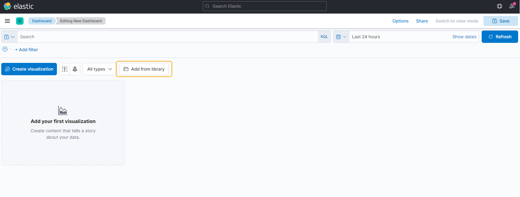
A menu will open and there we can select the visualizations that have already been created, or create a new one.
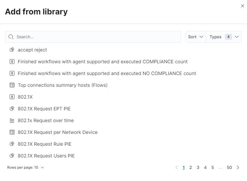
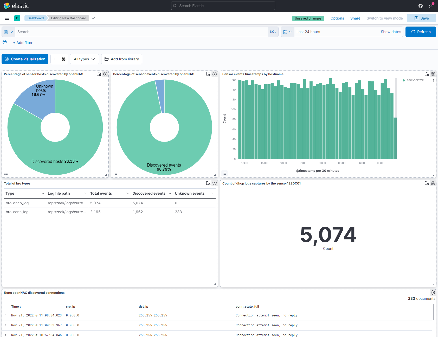
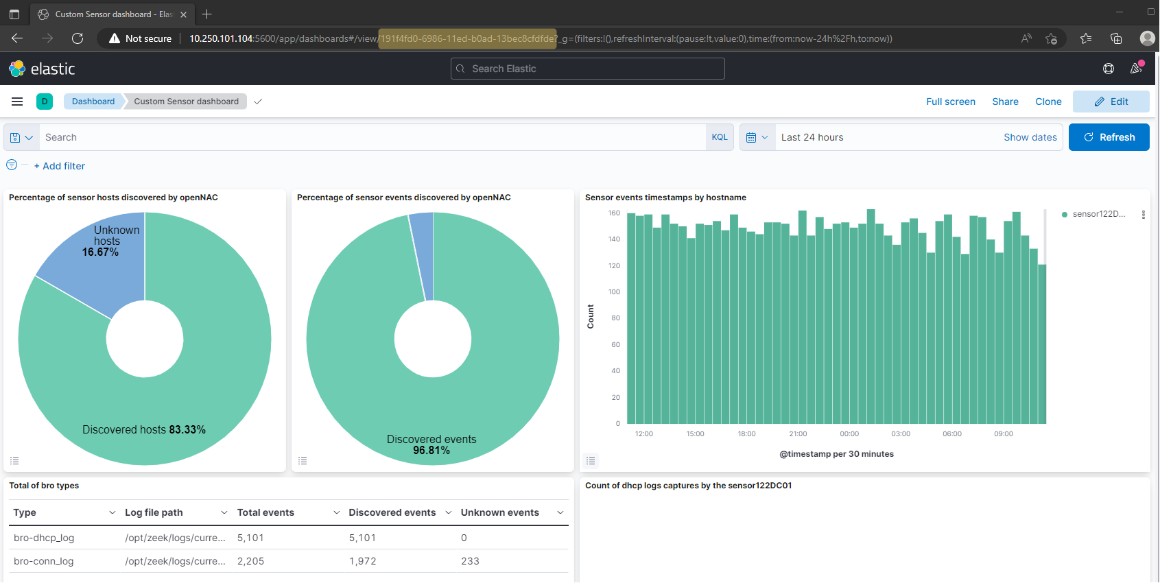
For example, we will add the visualizations and the search created previously:
None OpenNAC discovered connections
Percentage of sensor events discovered by OpenNAC
Percentage of sensor hosts discovered by OpenNAC
Sensor events timestamp by hostname
Count of dhcp logs captured by the sensor122DC01
Total of bro types
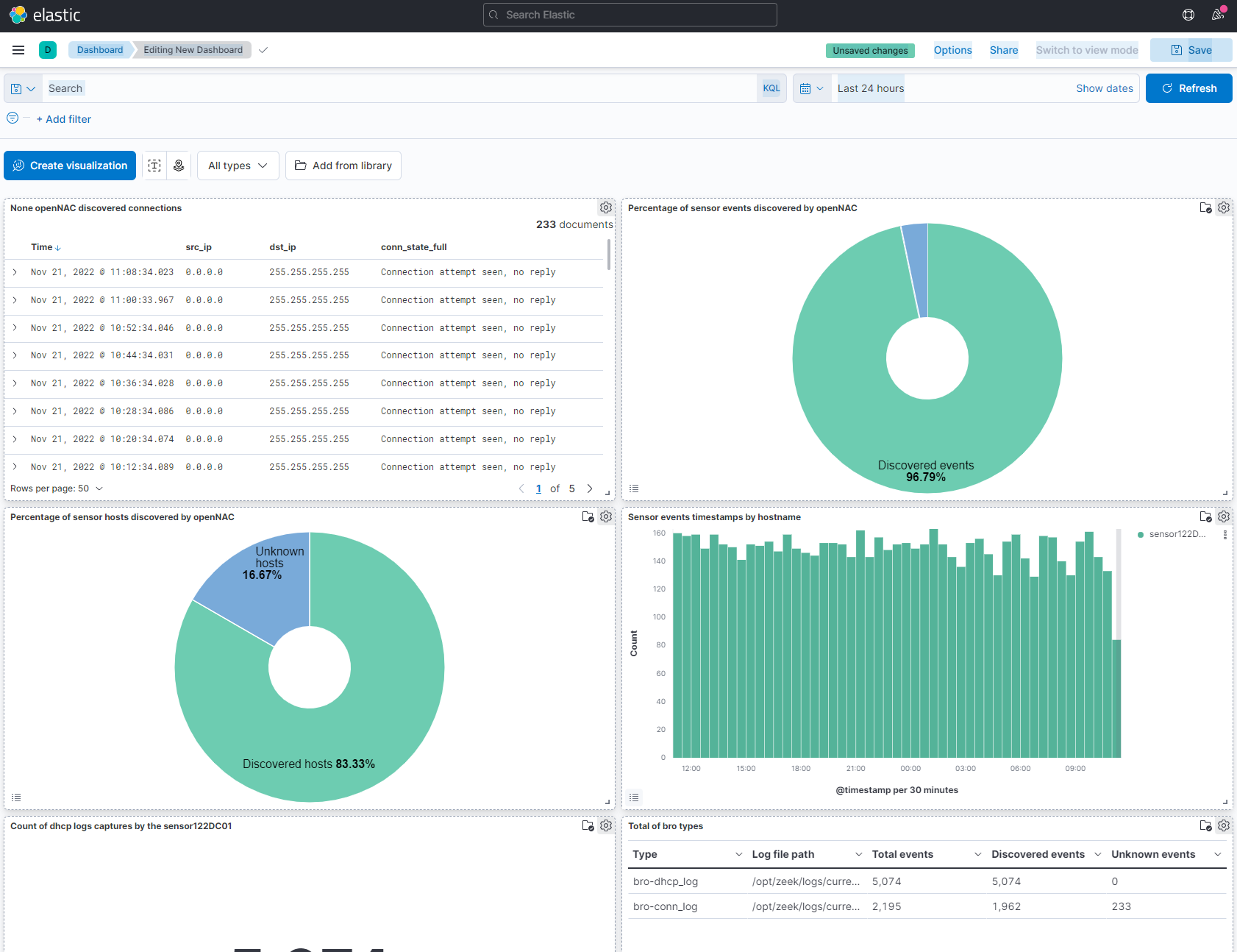
Now that they are added, we can edit their distribution and the panels themselves by clicking on the gear icon in the upper right corner of the interface.
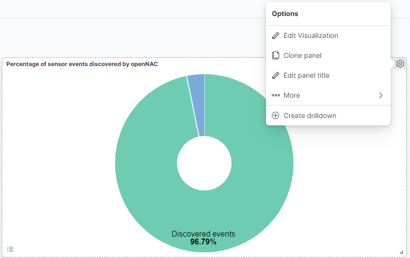
Edit visualization: Access the visualization editor.
Clone panel: Clones the panel under another name.
Edit panel title: Allows to change the title of the visualizations panel without changing the visualizations name.
More: Allows accessing more options.
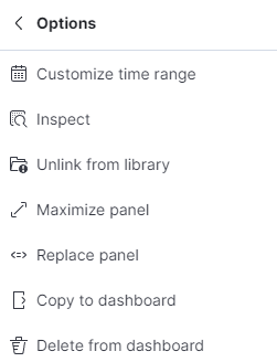
Customize time range: Customizes time range only for the specific panel.
Inspect: Allows seeing data statistics and the requests for the panel.
Unlink from library: Unlinks the panel from the library.
Maximize panel: Allows to see the visualization in full screen.
Replace panel: Replaces the panel with another one in the library.
Copy to dashboard: Copies the panel to another dashboard.
Delete from dashboard: Deletes the visualization from the dashboard.
Drilldown: Allows the user to go to another dashboard when a filter is set.
Here you have an example of a distribution for this dashboard:
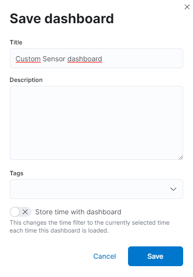
Finally, save the dashboard.
7.3.5. Add Dashboard to OpenNAC
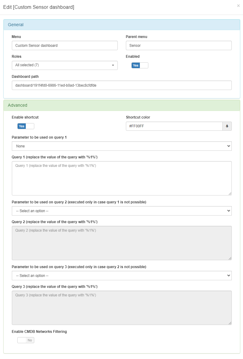
To add the dashboard we have created, we need to go to Configuration -> Dashboards in OpenNAC Enterprise.
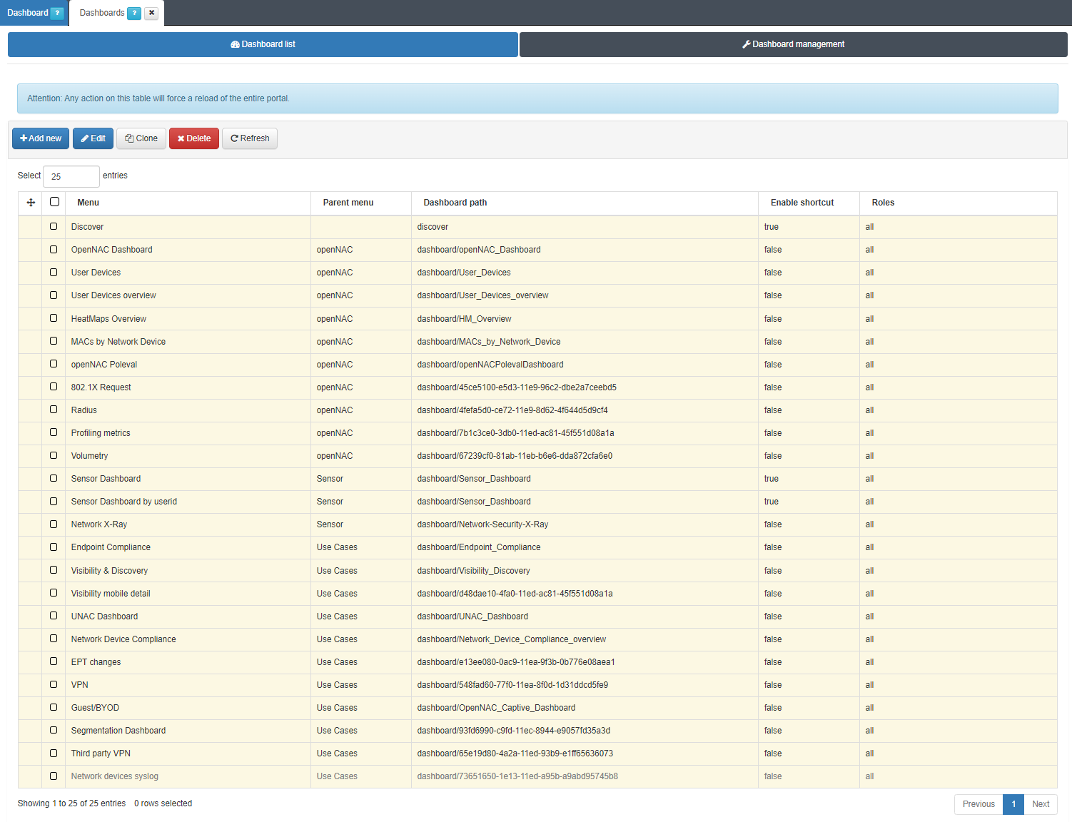
Click on Add new and enter the information corresponding to your dashboard:
Menu: Name that you want to give to the dashboard in OpenNAC. In our case, Custom Sensor dashboard.
Parent menu: Name of the parent menu that the dashboard will be located inside the Analytics module. In our case, Sensor.
Roles: User roles that will be able to see this dashboard menu. The roles you see are created in ON CMDB -> Security -> Roles. In our case, all the roles can see the dashboard.
Enabled: Allows to enable the dashboard in the menu.
Dashboard path: Location of the dashboard in Kibana. Normally the dashboards are found in the path dashboard/{DASHBOARD_ID}. In our case the path is /dashboard/191f4fd0-6986-11ed-b0ad-13bec8cfdfde.
Enable shortcut: Enables a shortcut to the dashboard from ON NAC -> Business Profiles on the Status column on the table of any view. In our case we want to enable it.
Shortcut color: Color of the shortcut. In our case is FF00FF.
Parameter to be used on query X: Parameter for the query. We can find the URI, the MAC, the IP, and the User ID. In our case we don’t want to query, so we select None.
Query X (replace the value of the query with ‘%1%’): Query used in the shortcut. The ‘%1%’ variable will substitute the parameter into the query. In our case it is not necessary.
Enable CMDB Networks Filtering: Enabling this field automatically adds the CMDB Networks as filter for this dashboard. In our case we don’t want to activate this option.
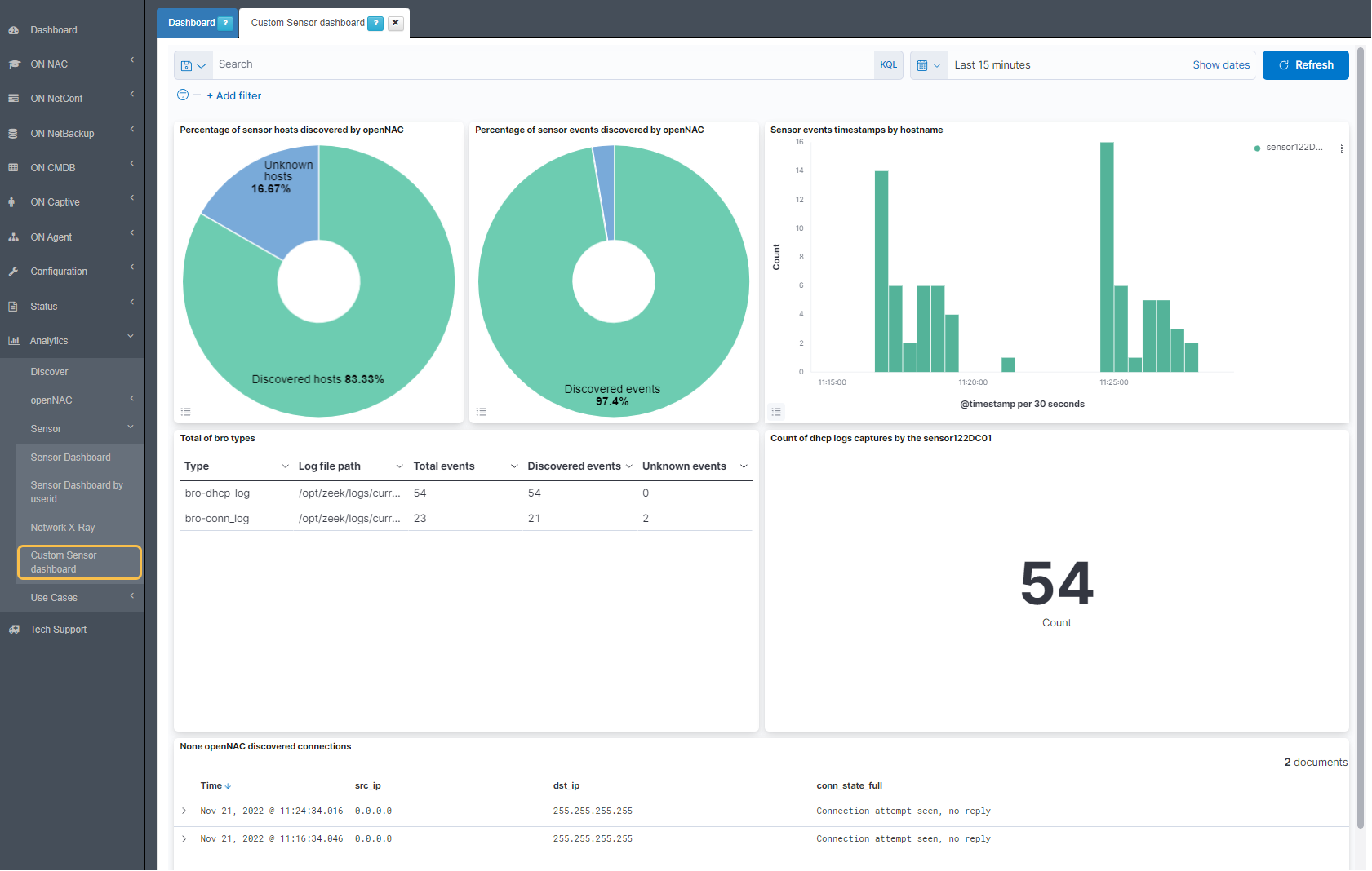
When you save it, the platform will reload and now you will see your new dashboard in Analytics -> Sensor -> Customized Sensor dashboard.
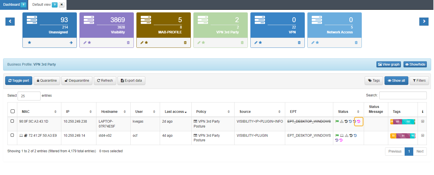
If you now go to a business profile on ON NAC -> Business Profiles -> Default view, you will see the shortcut in the color we have configured it.
7.3.6. Copy dashboard to another Kibana
If a Dashboard is created in a Kibana node and it is necessary to also added in another node, we will need to export it and import it to the new Kibana node.
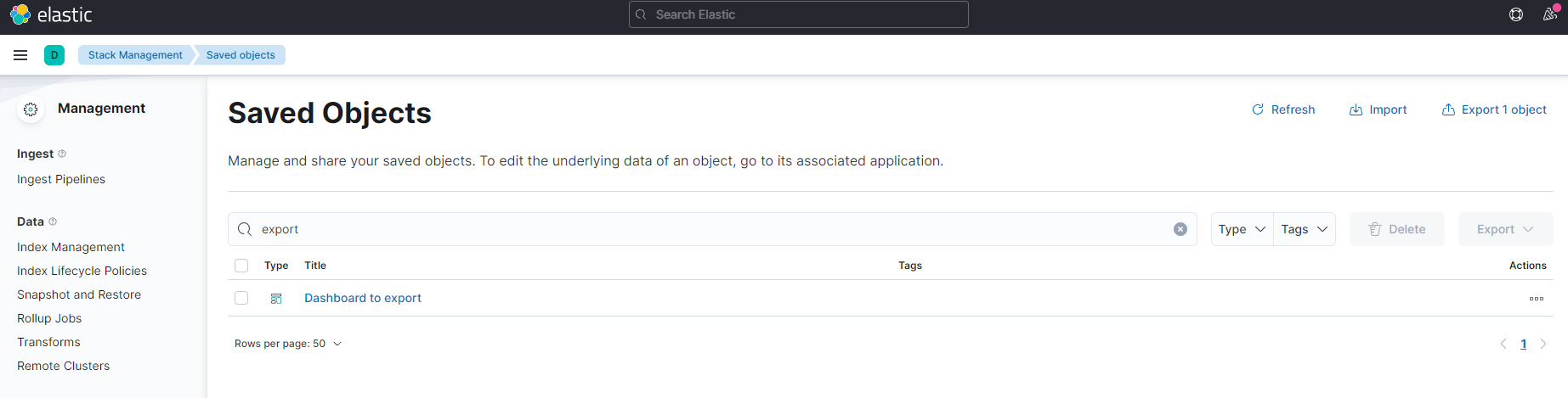
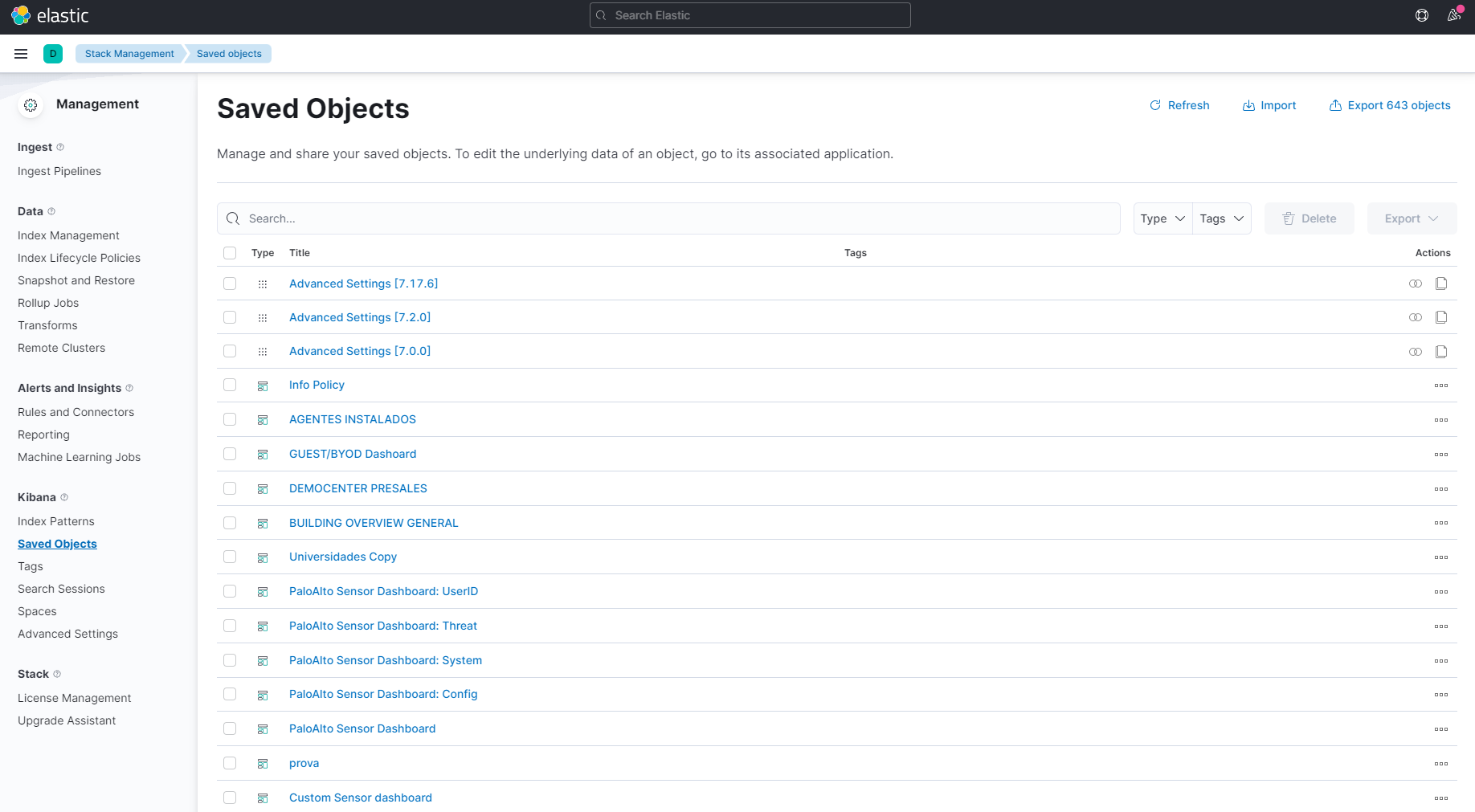
First of all we need to go Management -> Stack Management -> Kibana -> Saved Objects and search for the dashboard to export.
In this case we want to export the dashboard called Dashboard to export. We will select the dashboard and go to the right corner and click on Export. The Include related objects needs to be enabled.
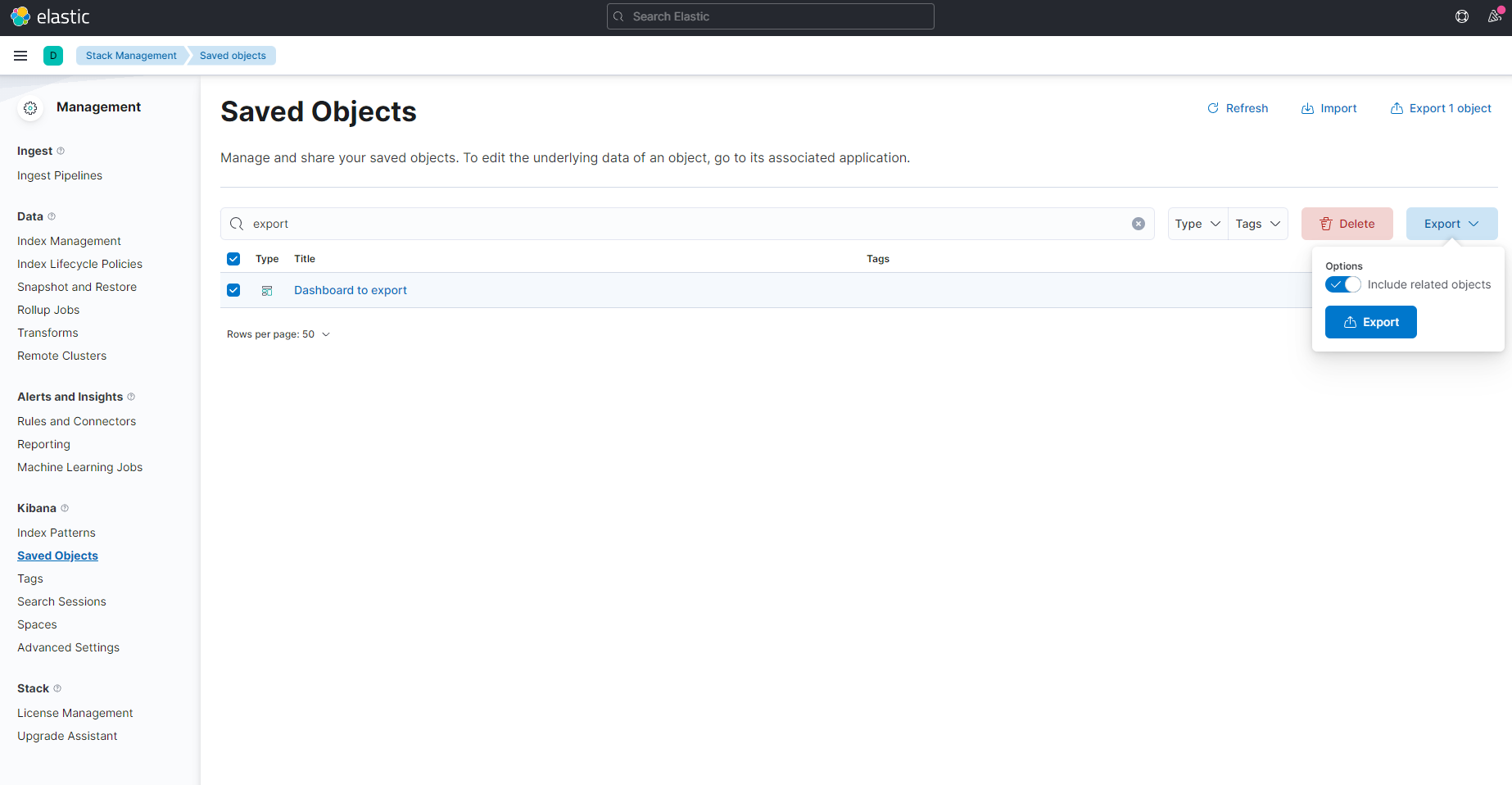
A .ndjson file will be downloaded.
Then, we need to go to the new Kibana where we want to import the dashboard. It is necessary to access Management -> Stack Management -> Kibana -> Saved Objects. We will click the Import button on the right corner.
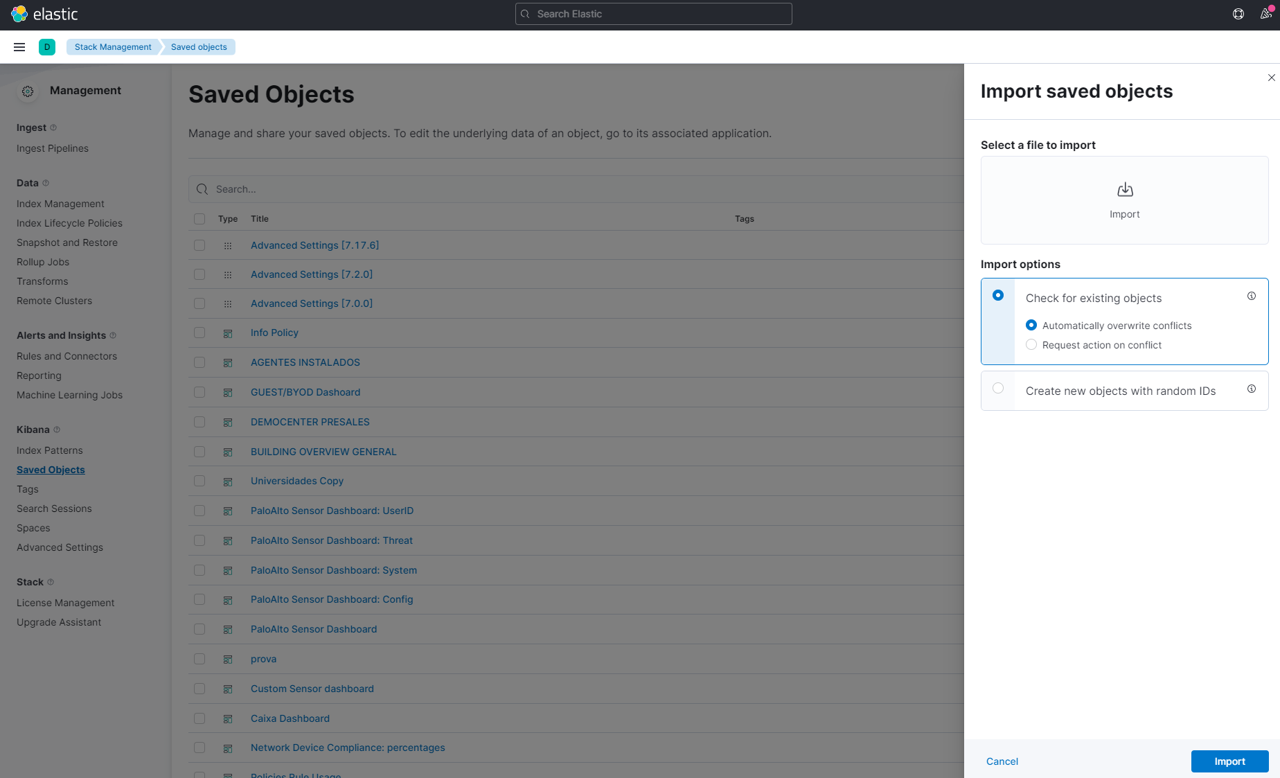
Add the .ndjson file exported previously and click on Import. Now, if we search for the dashboard in the new Kibana, we will see that it has been imported.